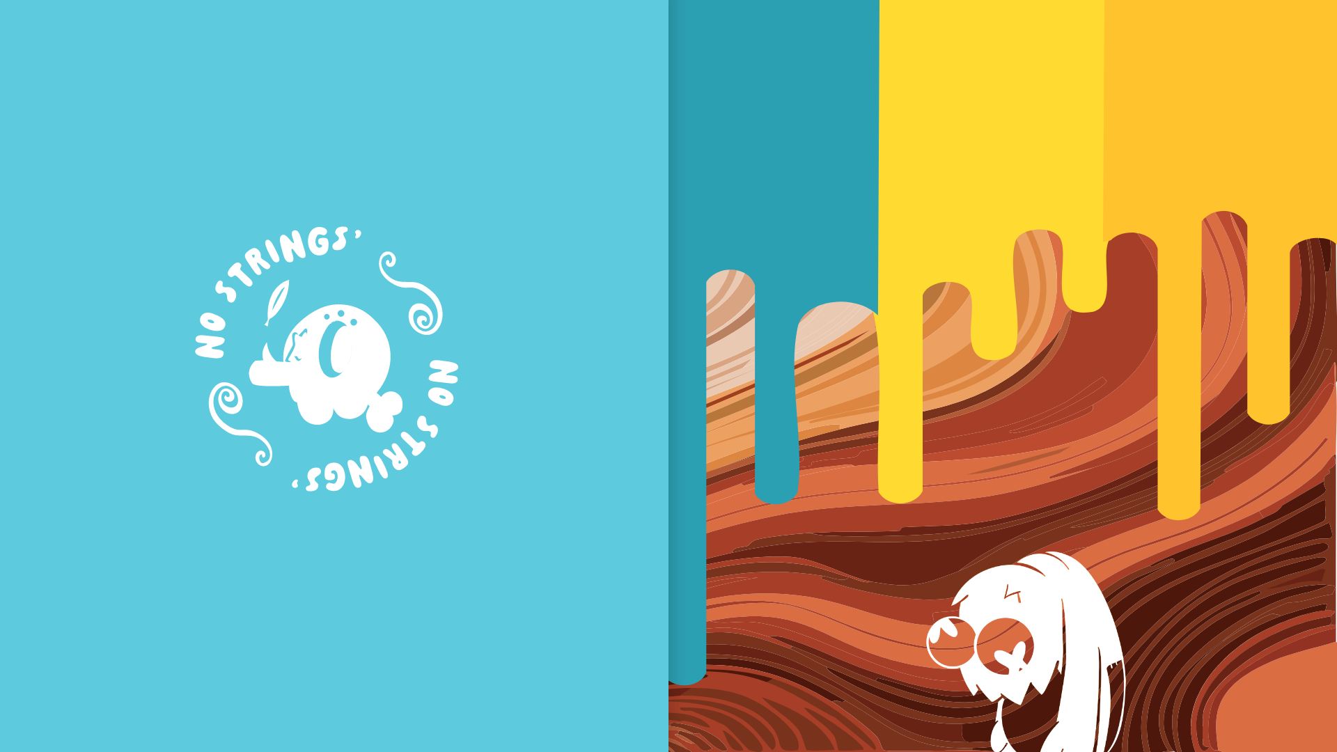
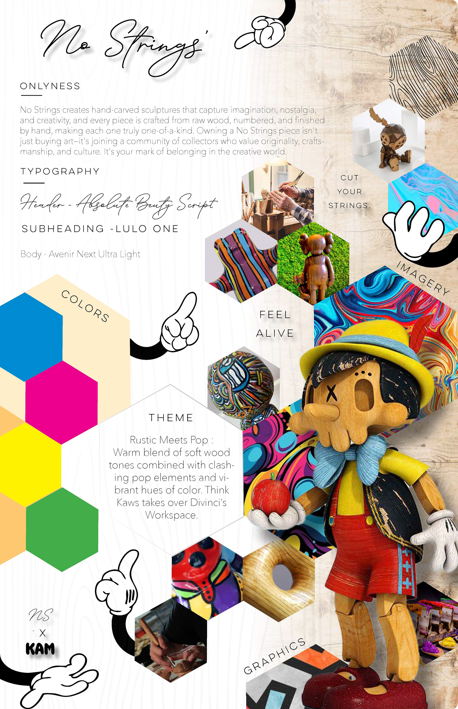
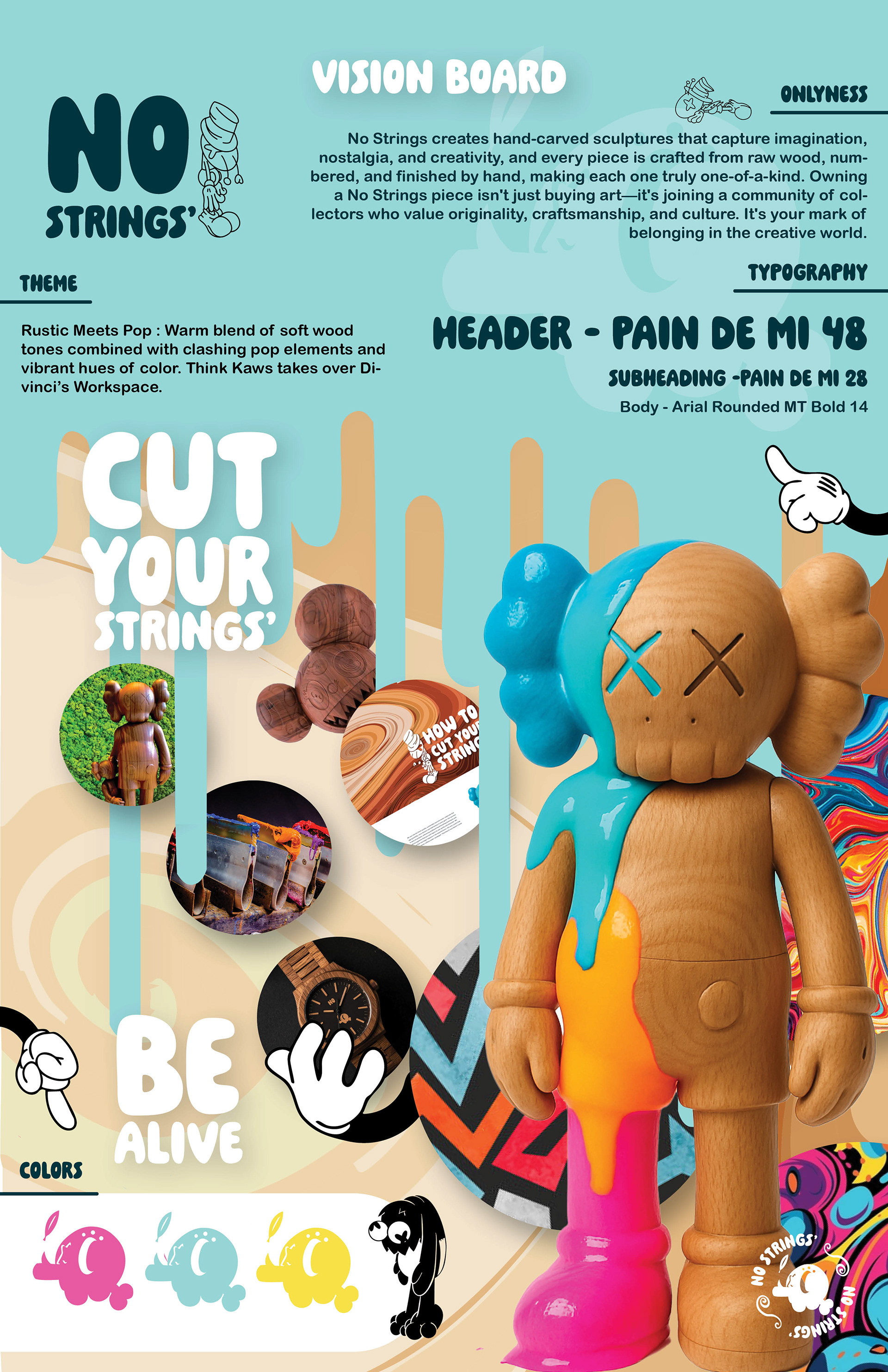
No Strings'
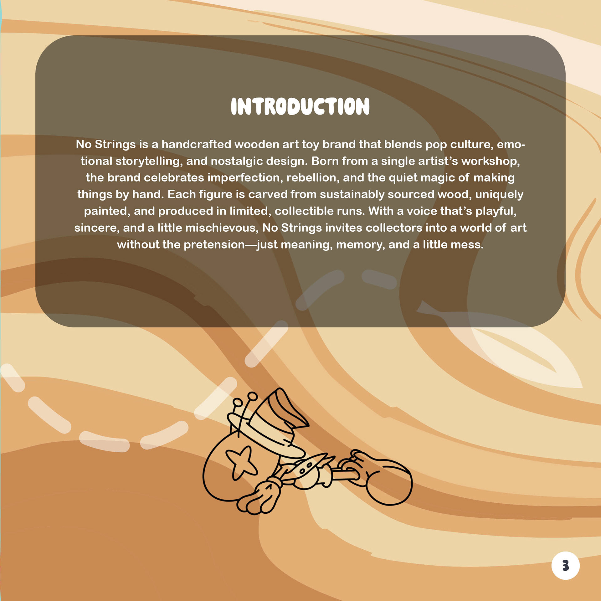
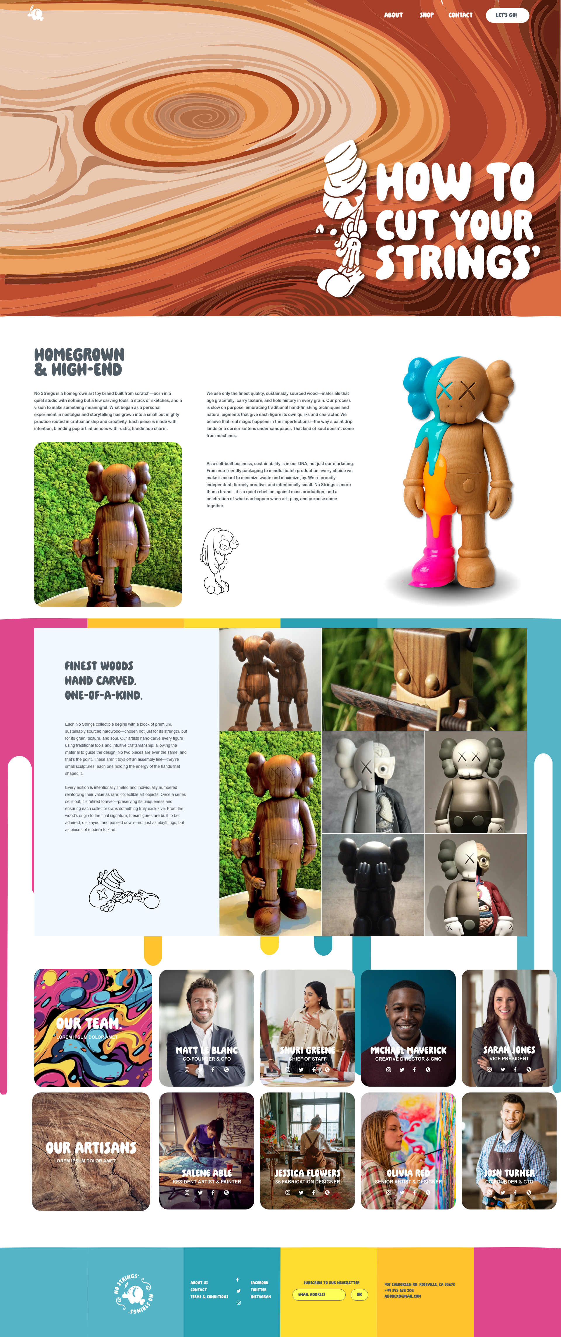
Remember when toys weren’t just things on a shelf, but adventures waiting to happen? No Strings is my answer to that memory. A wooden art toy brand that feels as nostalgic as Saturday morning cartoons and as rebellious as a spray-painted wall. It’s pop art meets sawdust, where handcrafted charm collides with limited-edition collectibility. This project takes you behind the scenes of how I built the identity, rules, and visuals that give No Strings its playful edge. Welcome to a brand that’s equal parts nostalgia trip and design experiment.
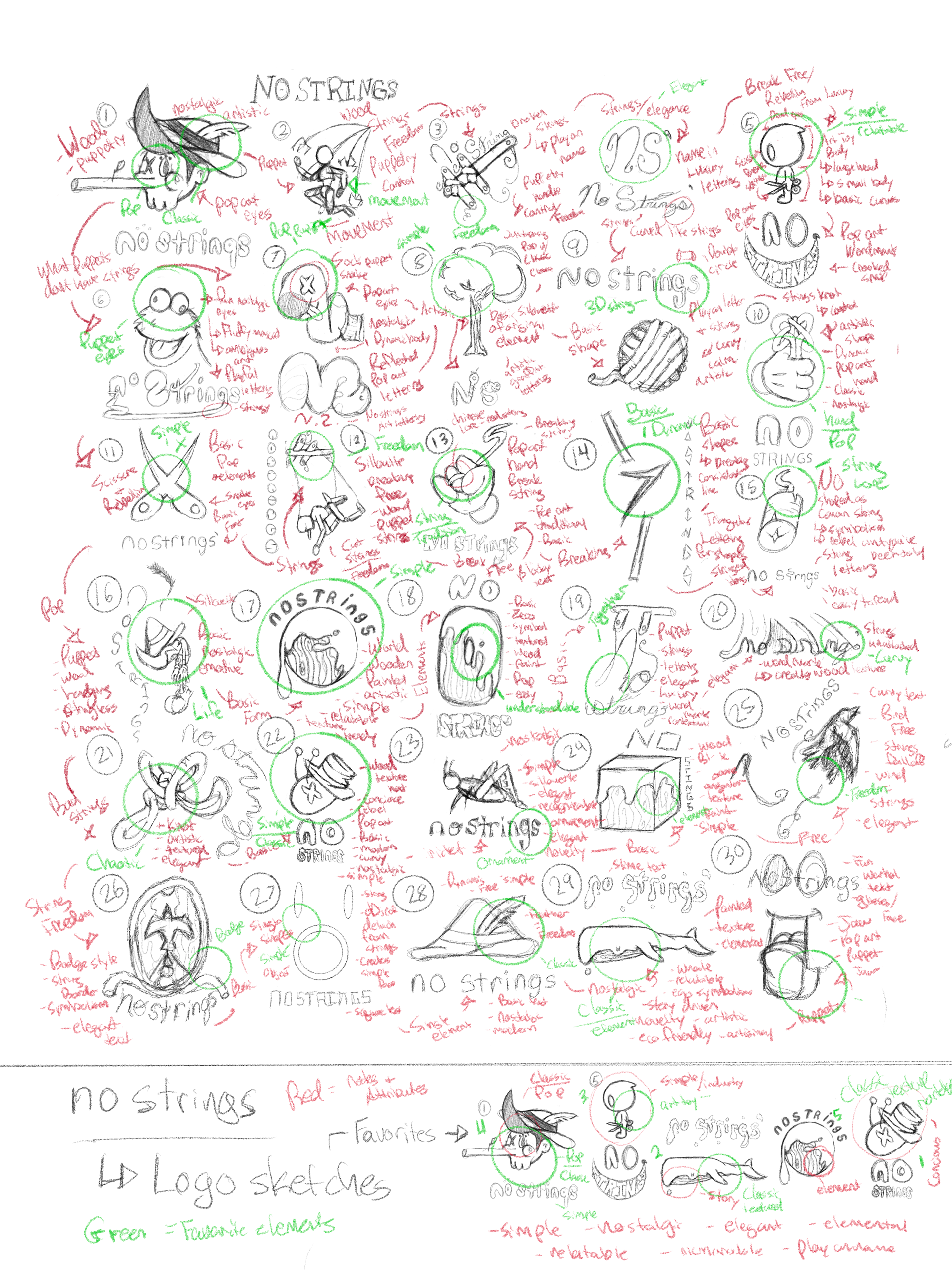
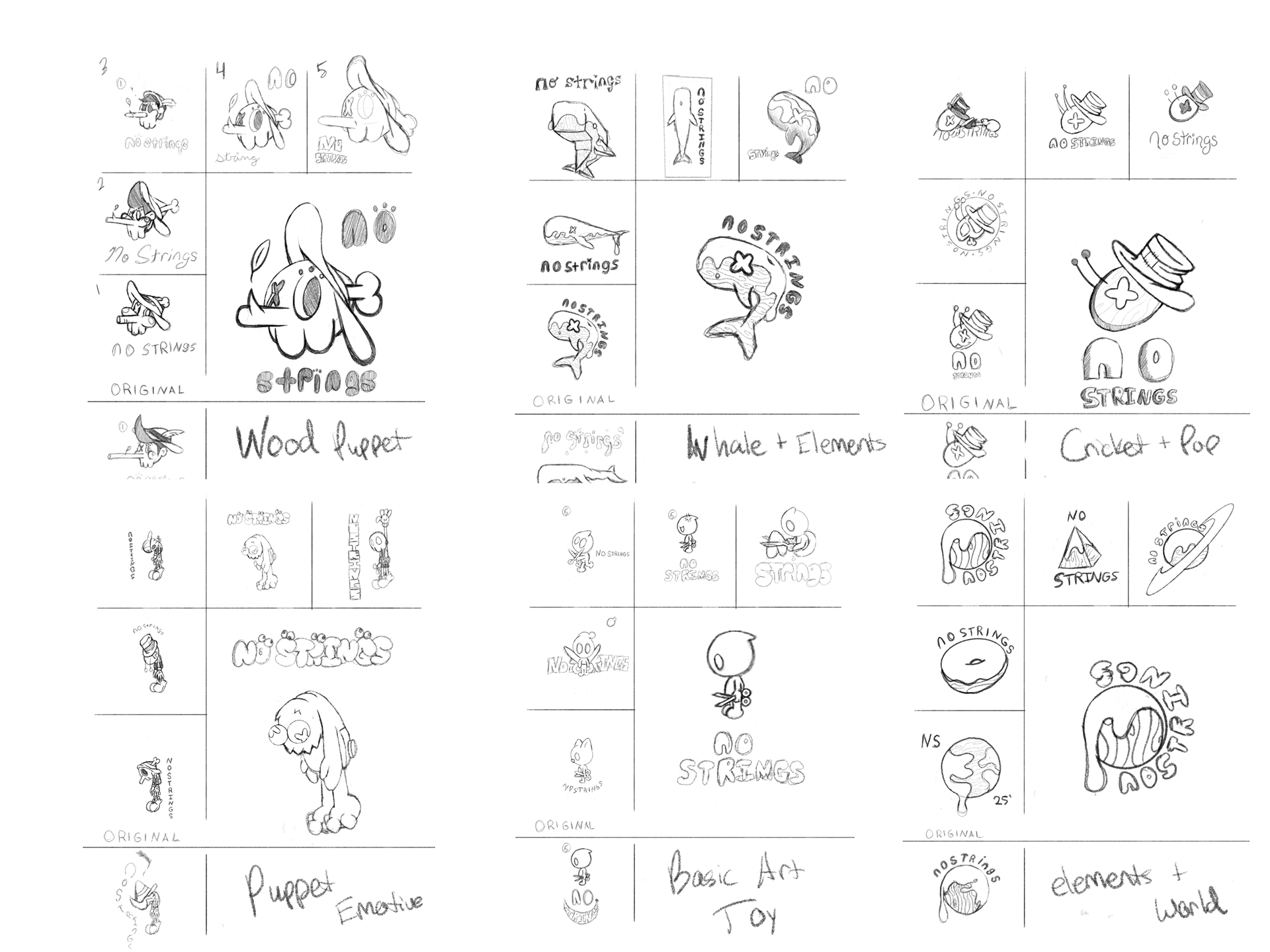
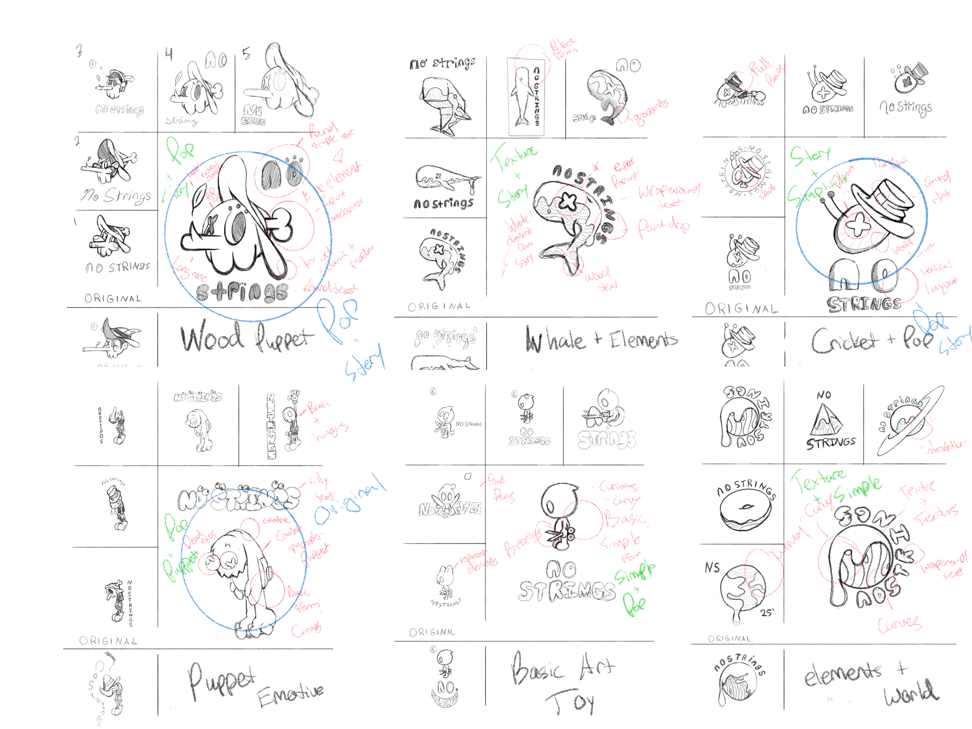
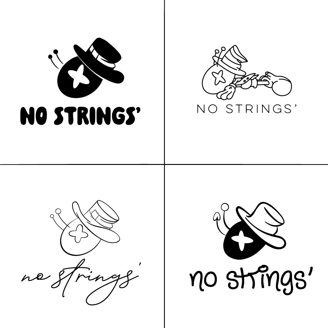
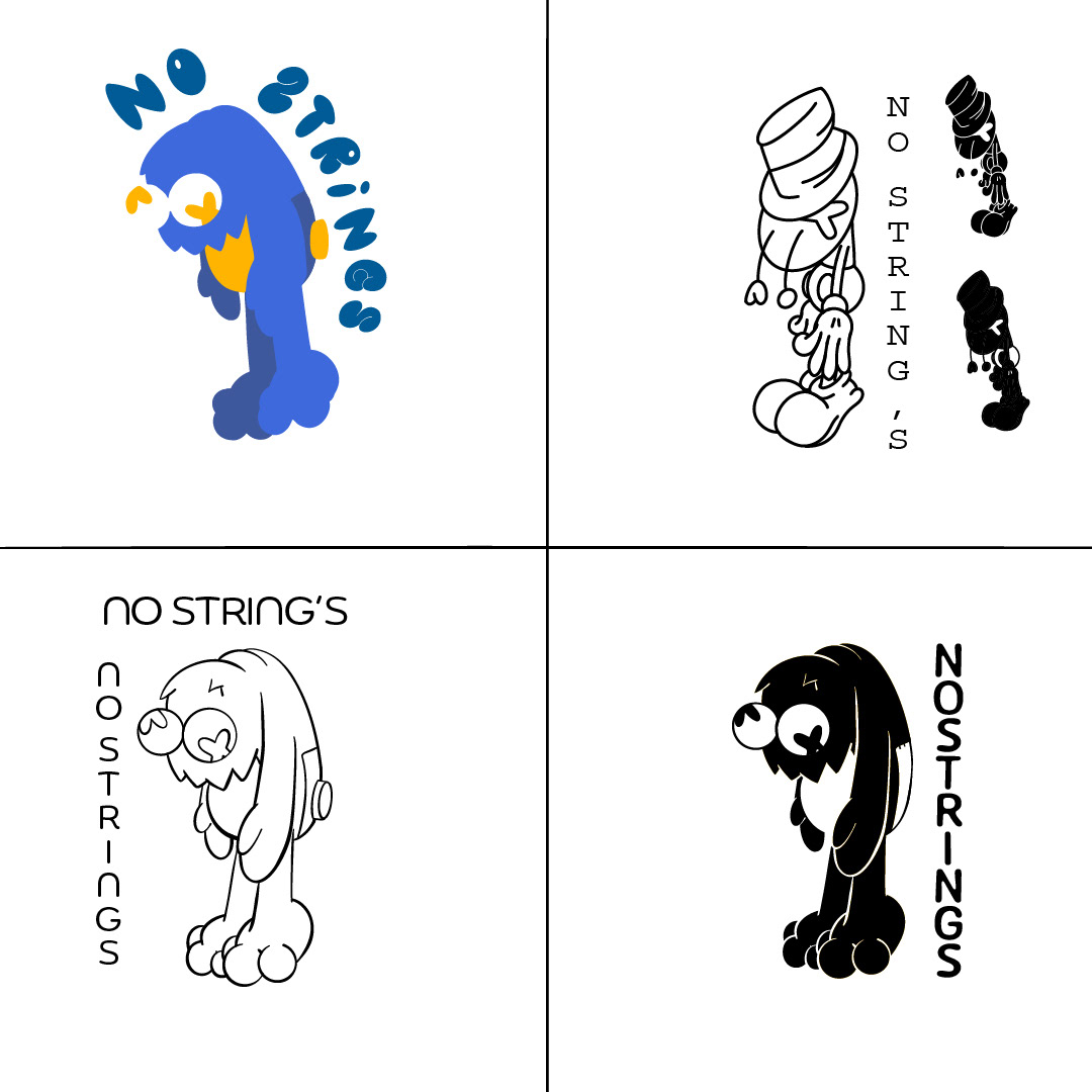
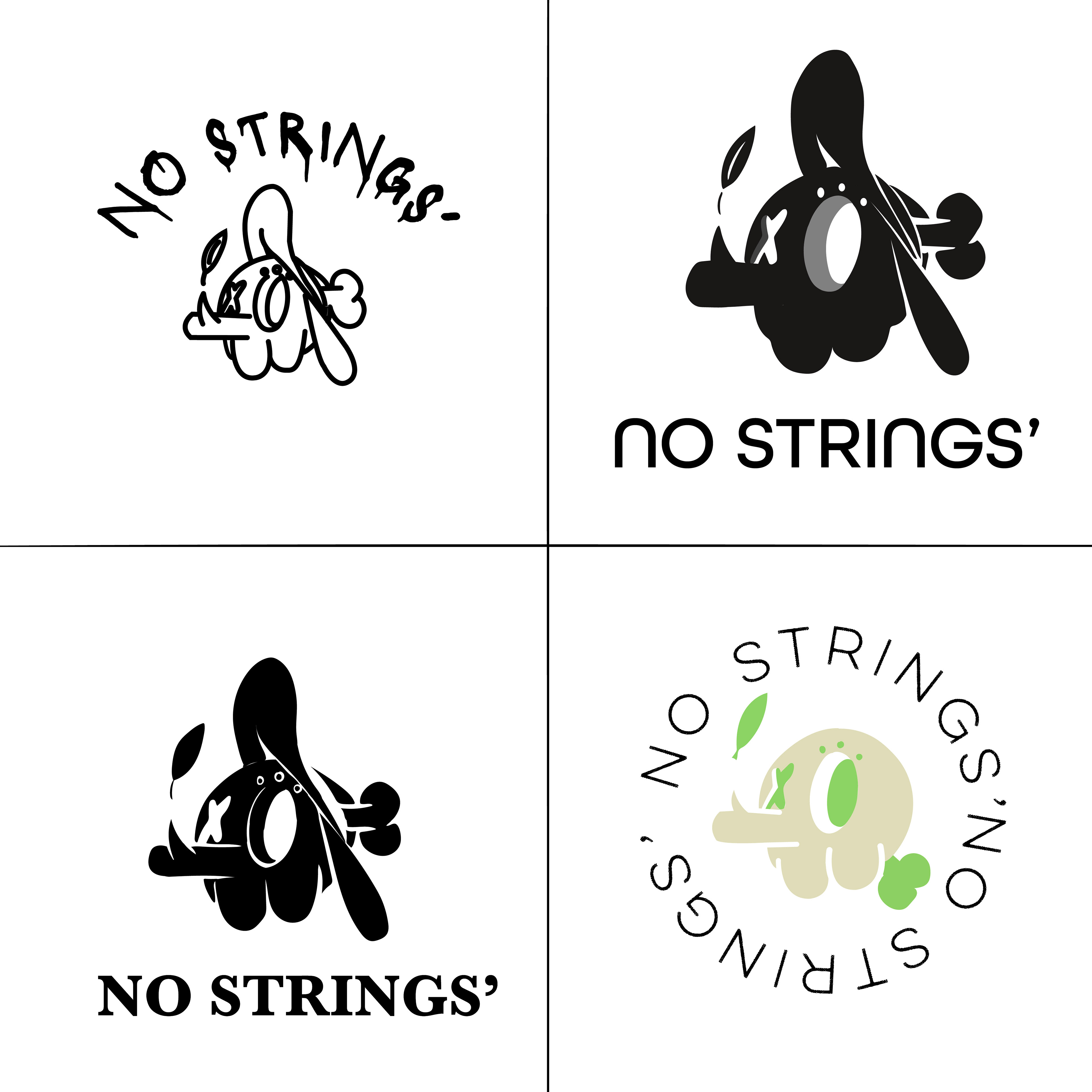
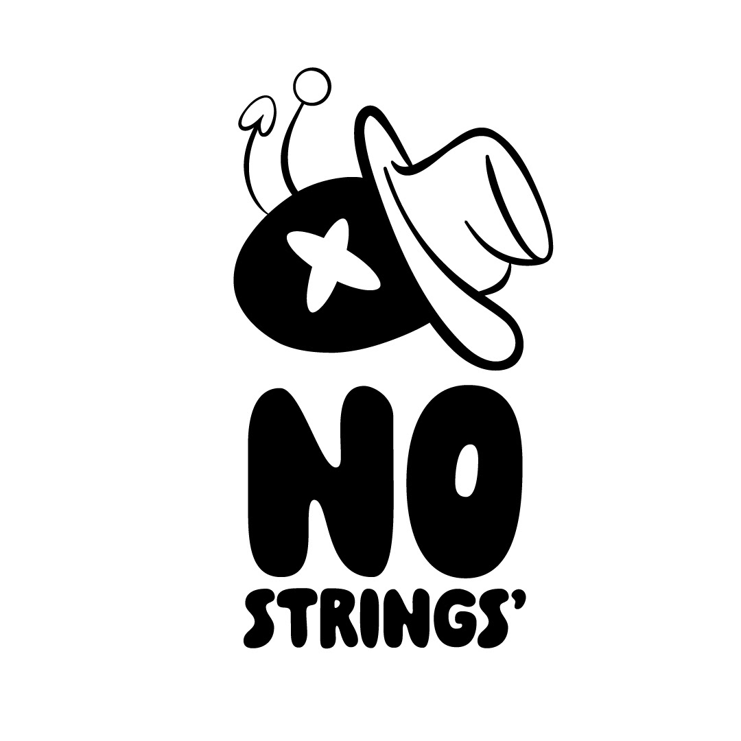
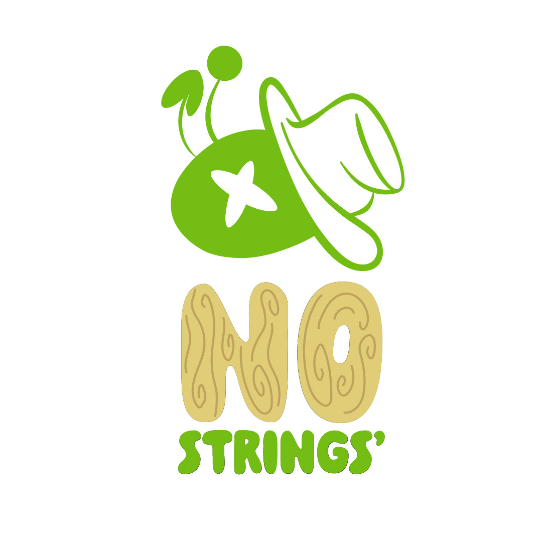
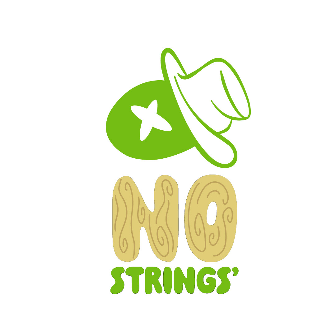
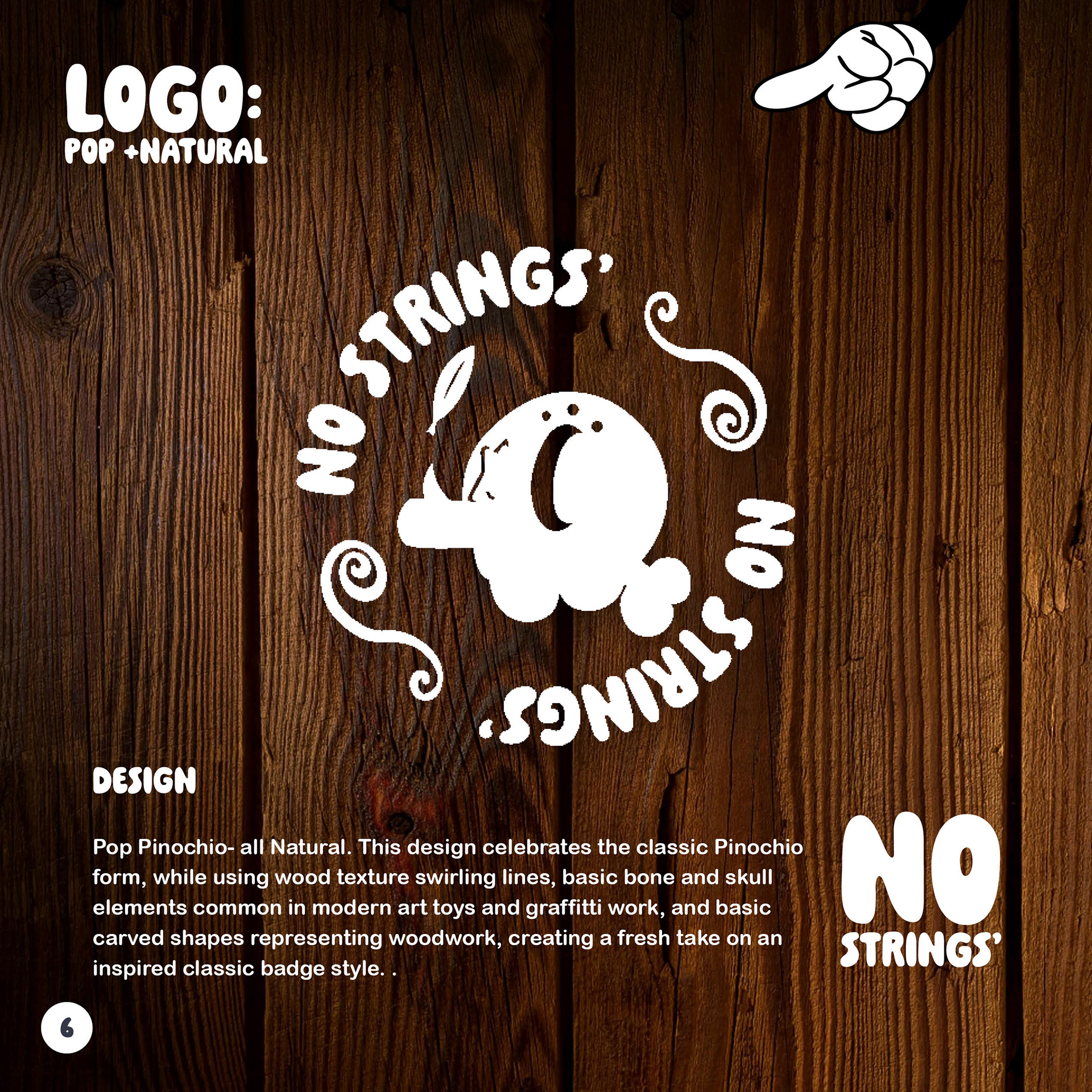
Logo Development
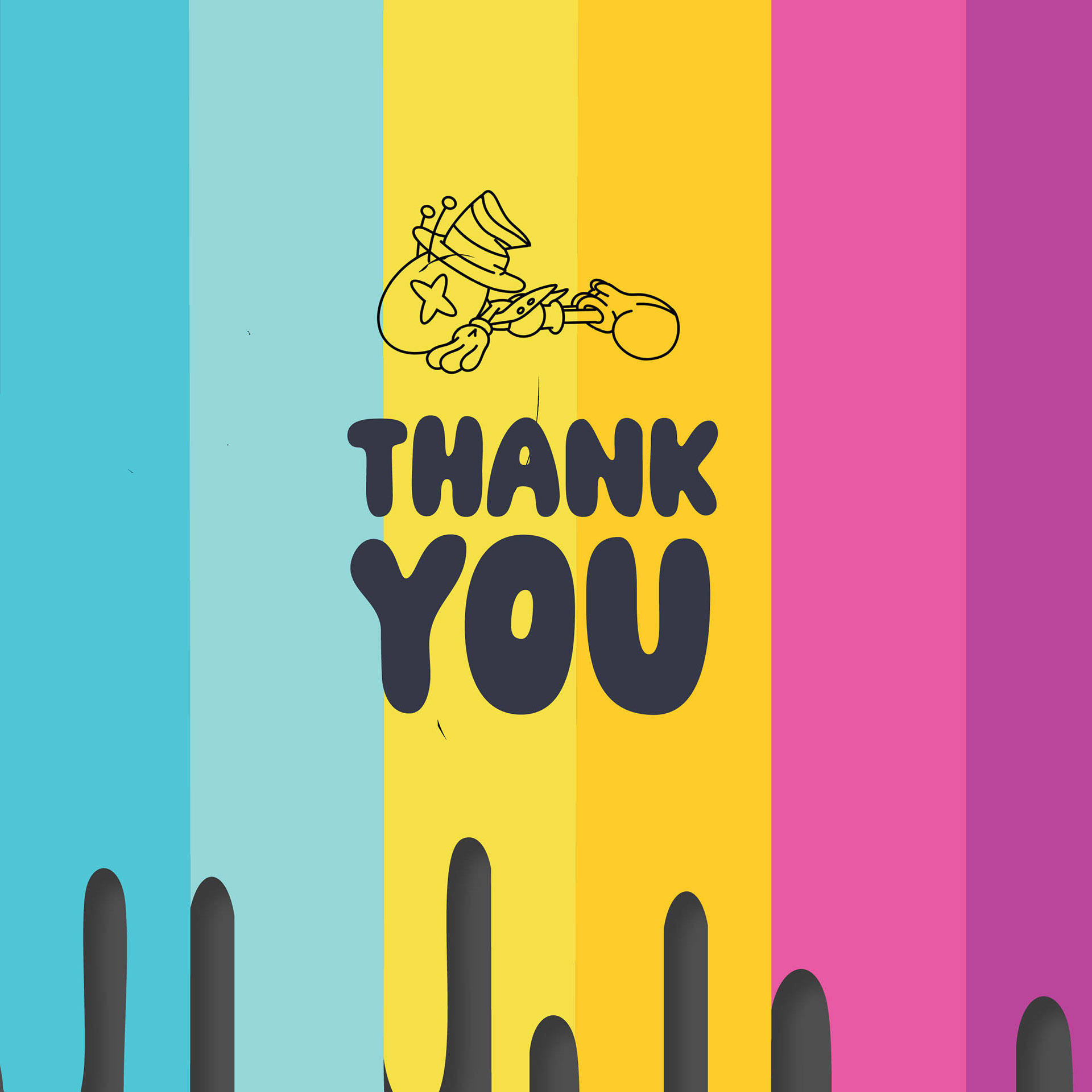
The logo had to feel like it could have been scrawled in a sketchbook between math class doodles, yet polished enough to live on gallery walls. I explored six directions, each riffing on rebellion, craft, and childhood whimsy, before locking into the final mark. The result? A bold wordmark with enough grit to feel handmade, and enough balance to anchor a brand built on limited runs and collector’s pride.
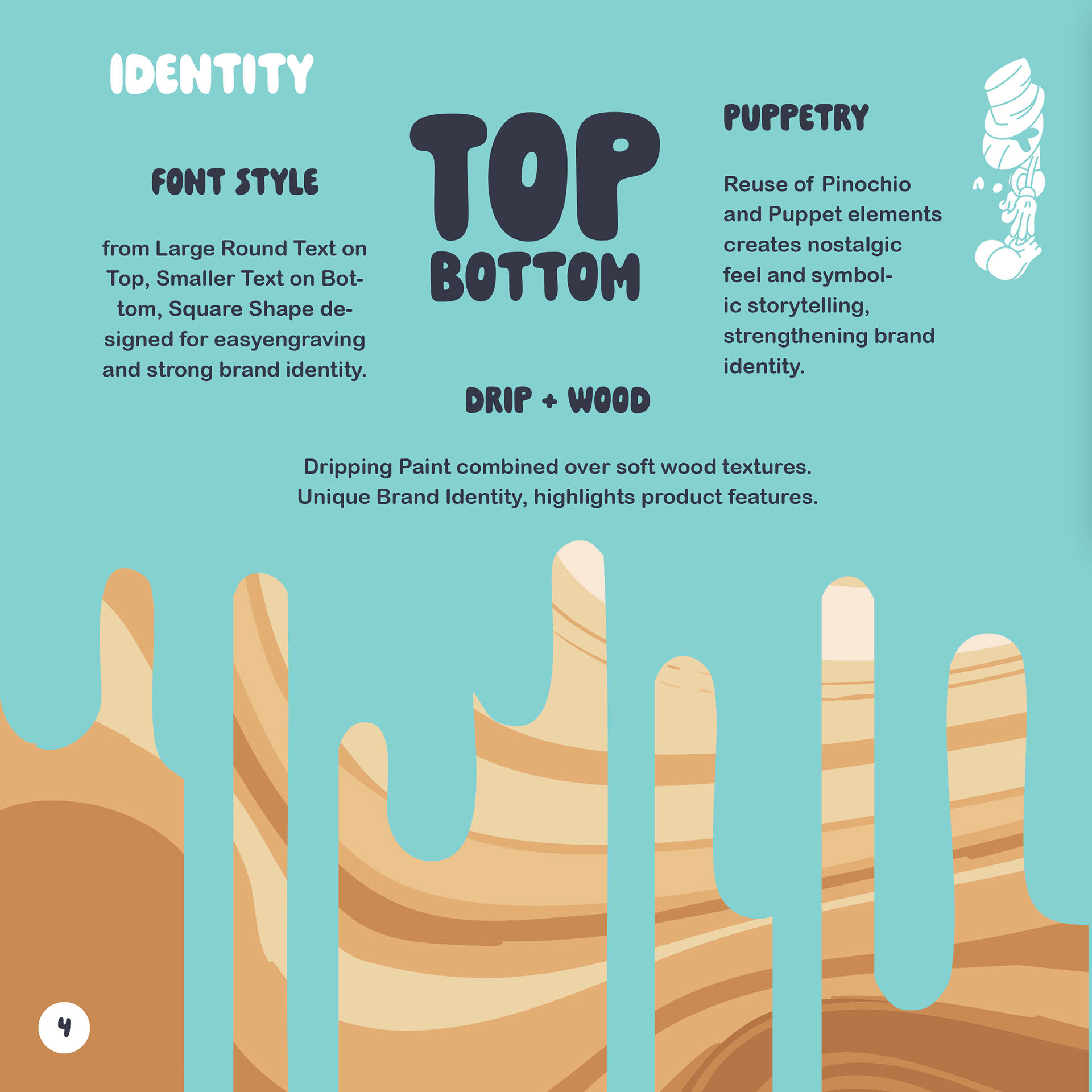
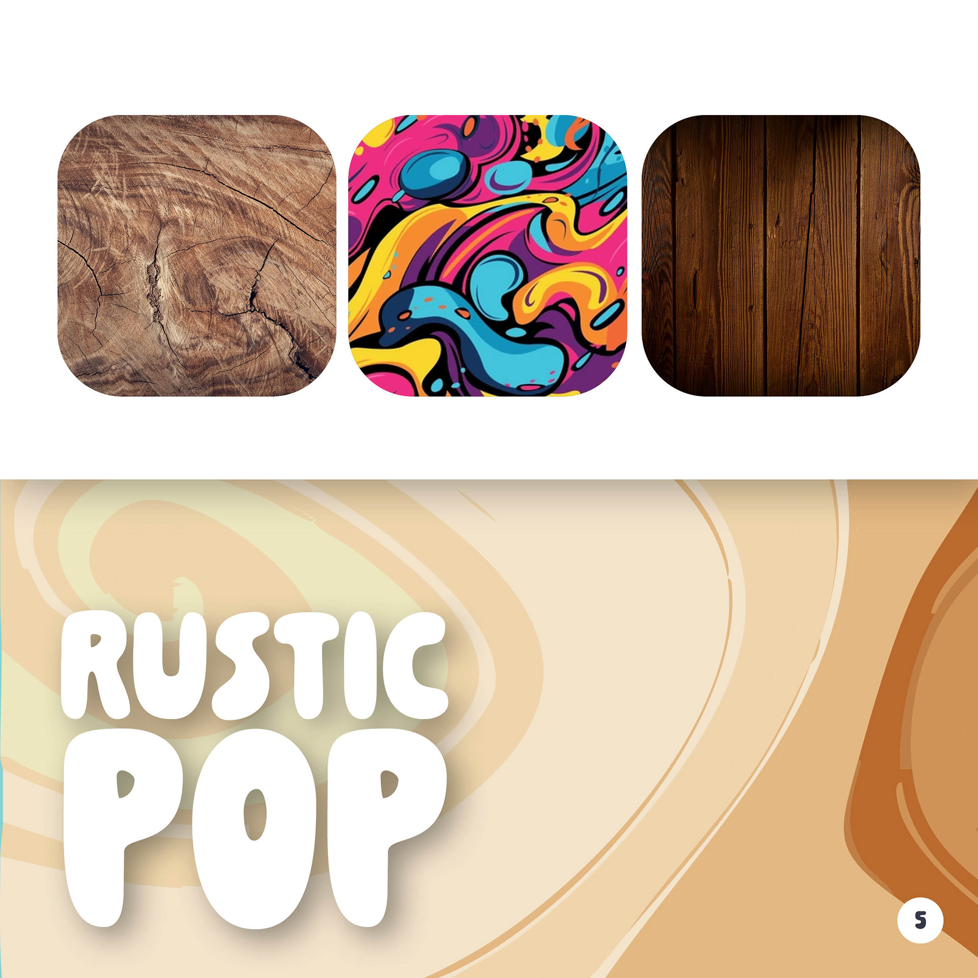
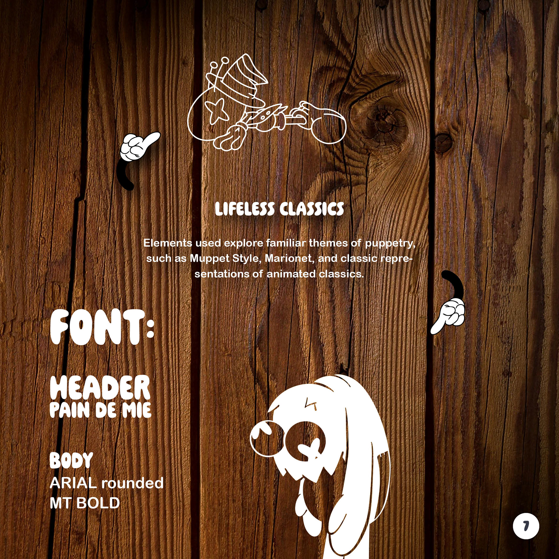
Style Development
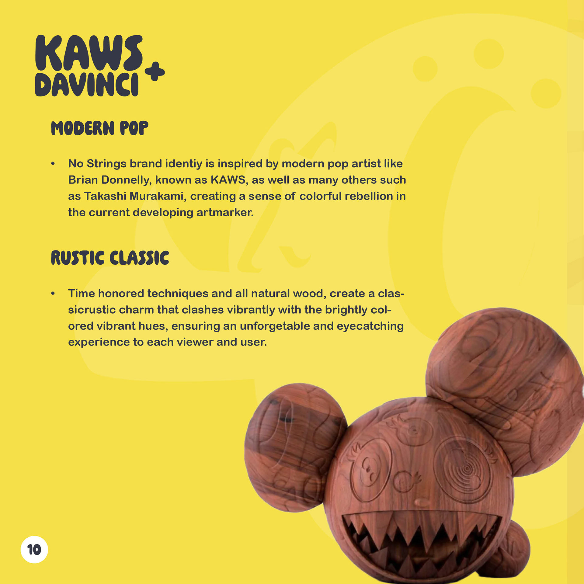
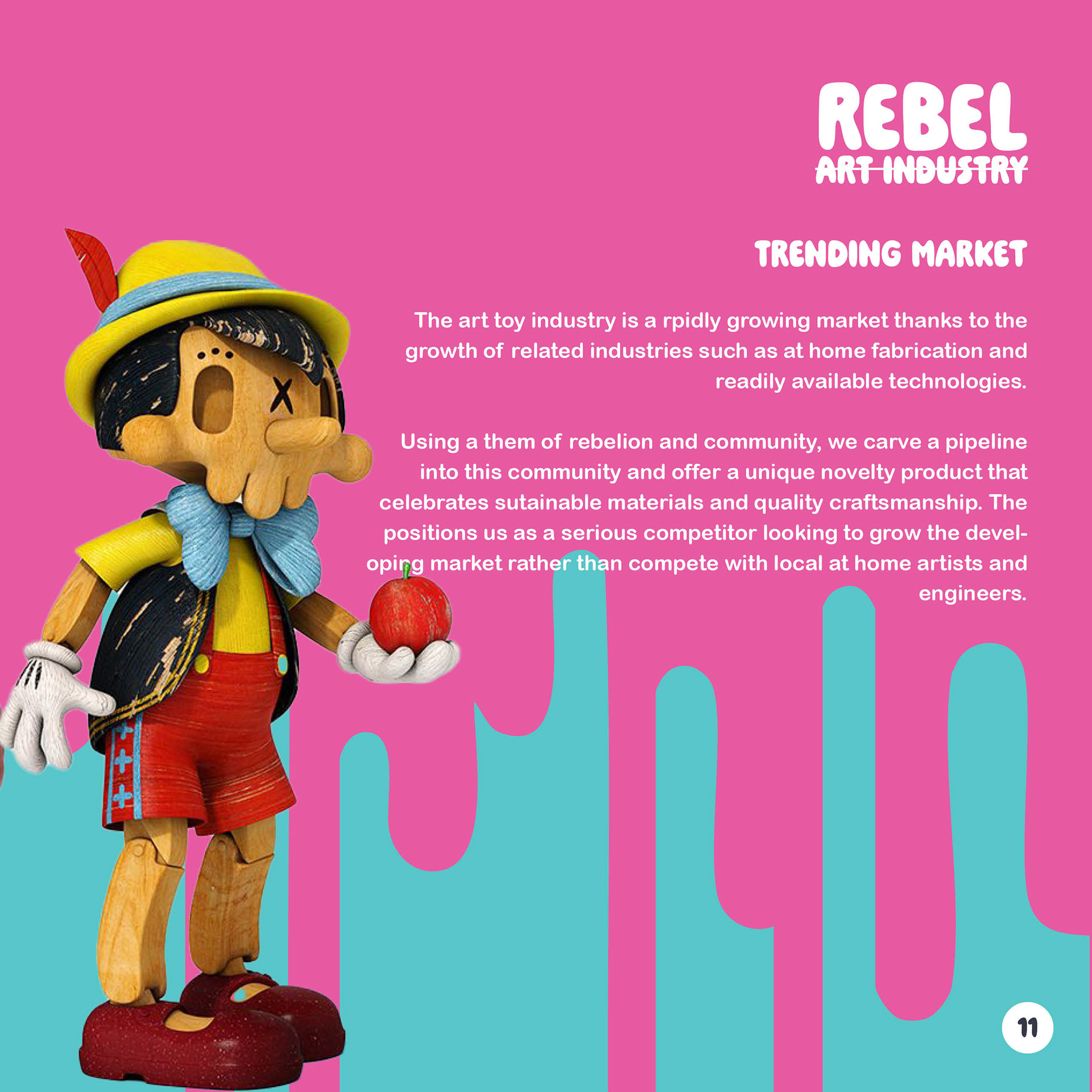
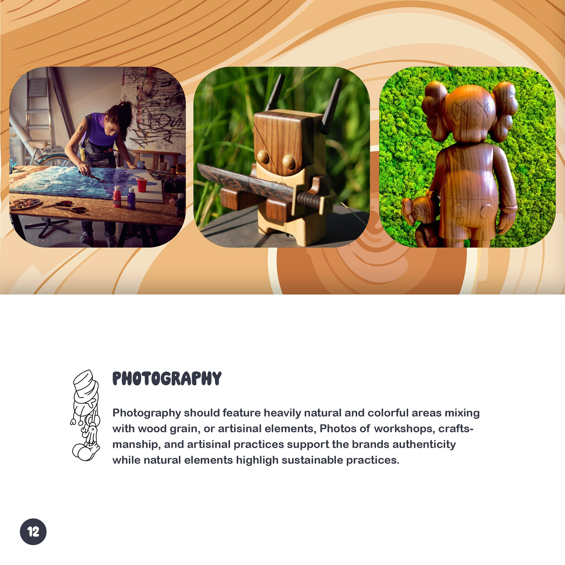
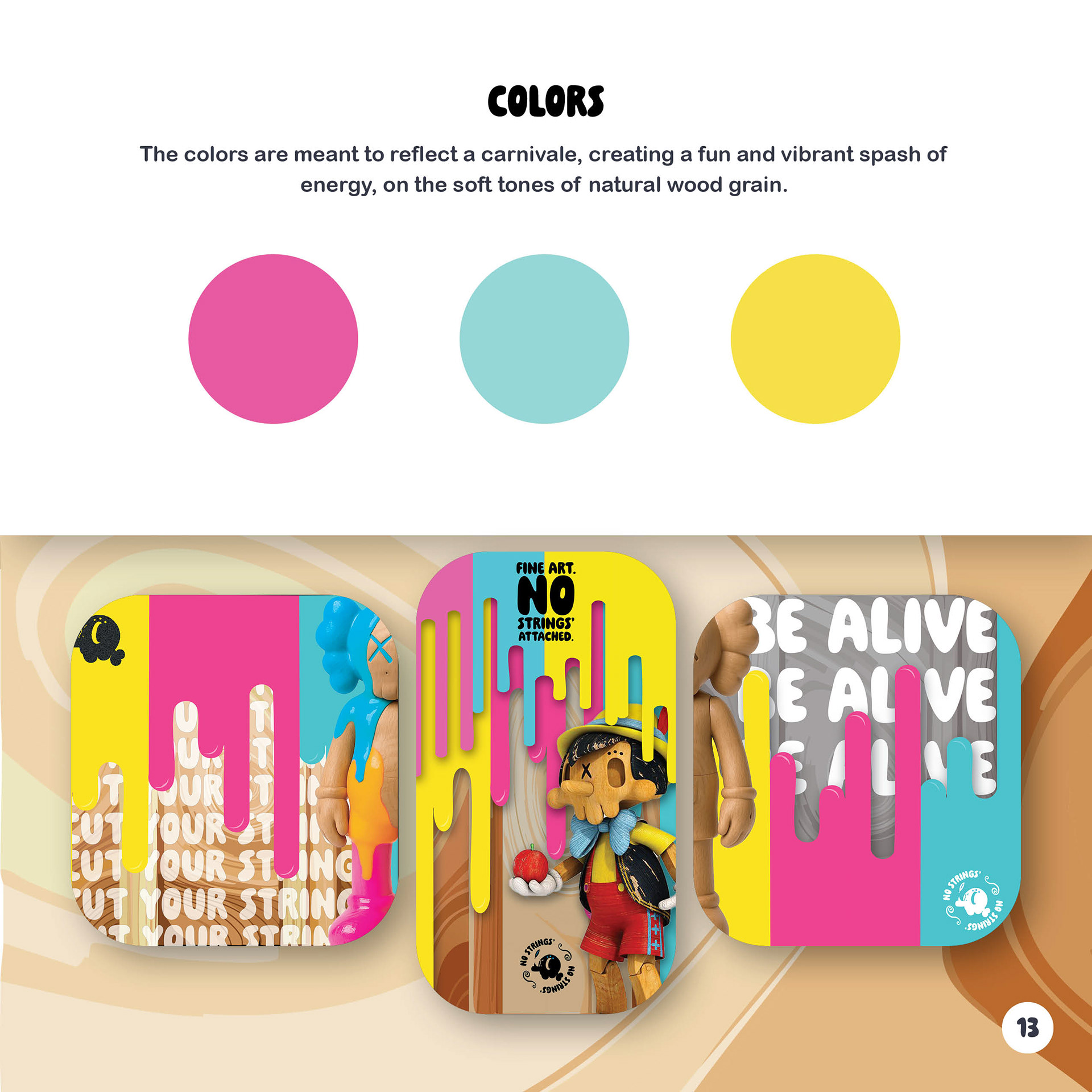
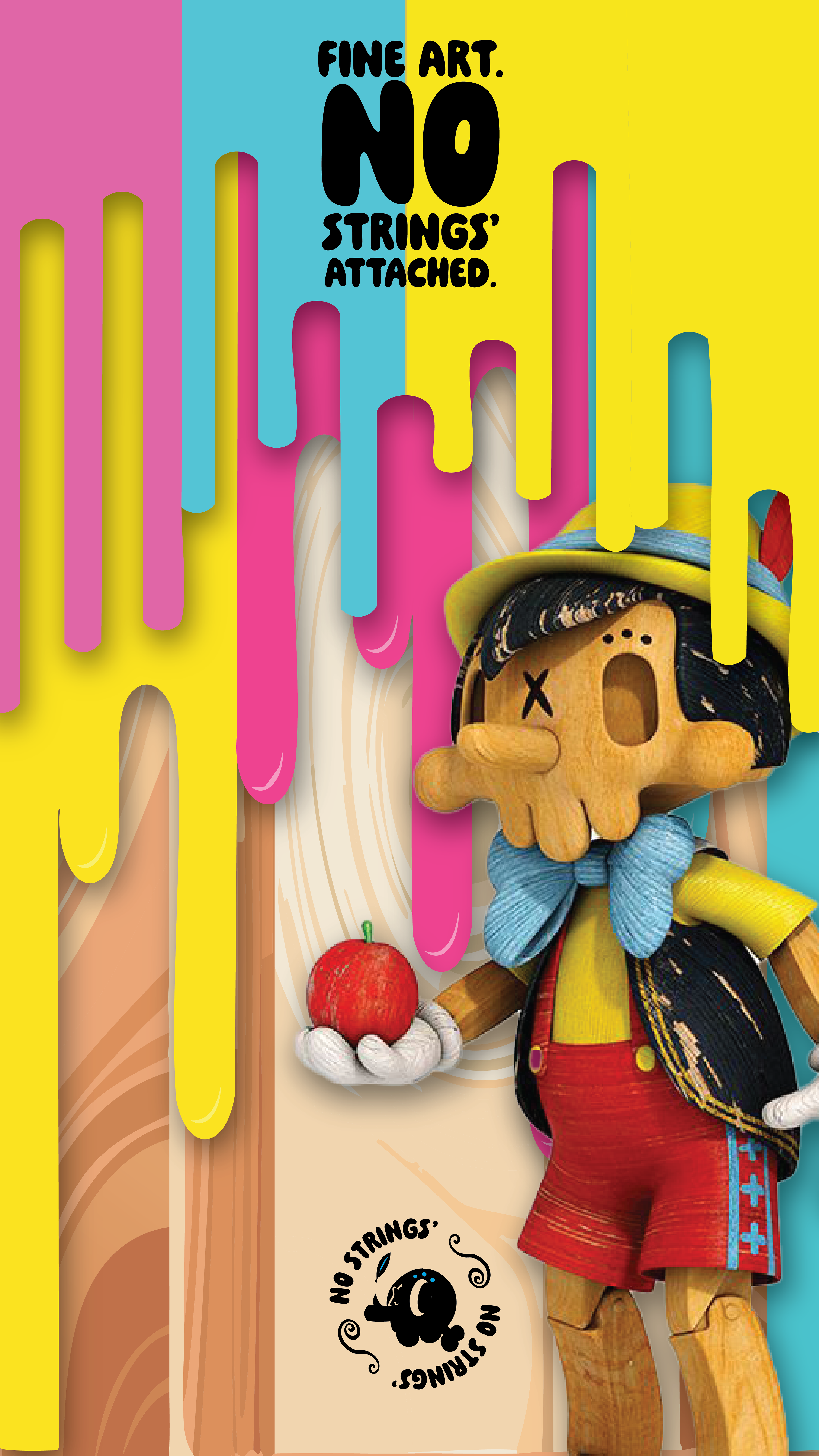
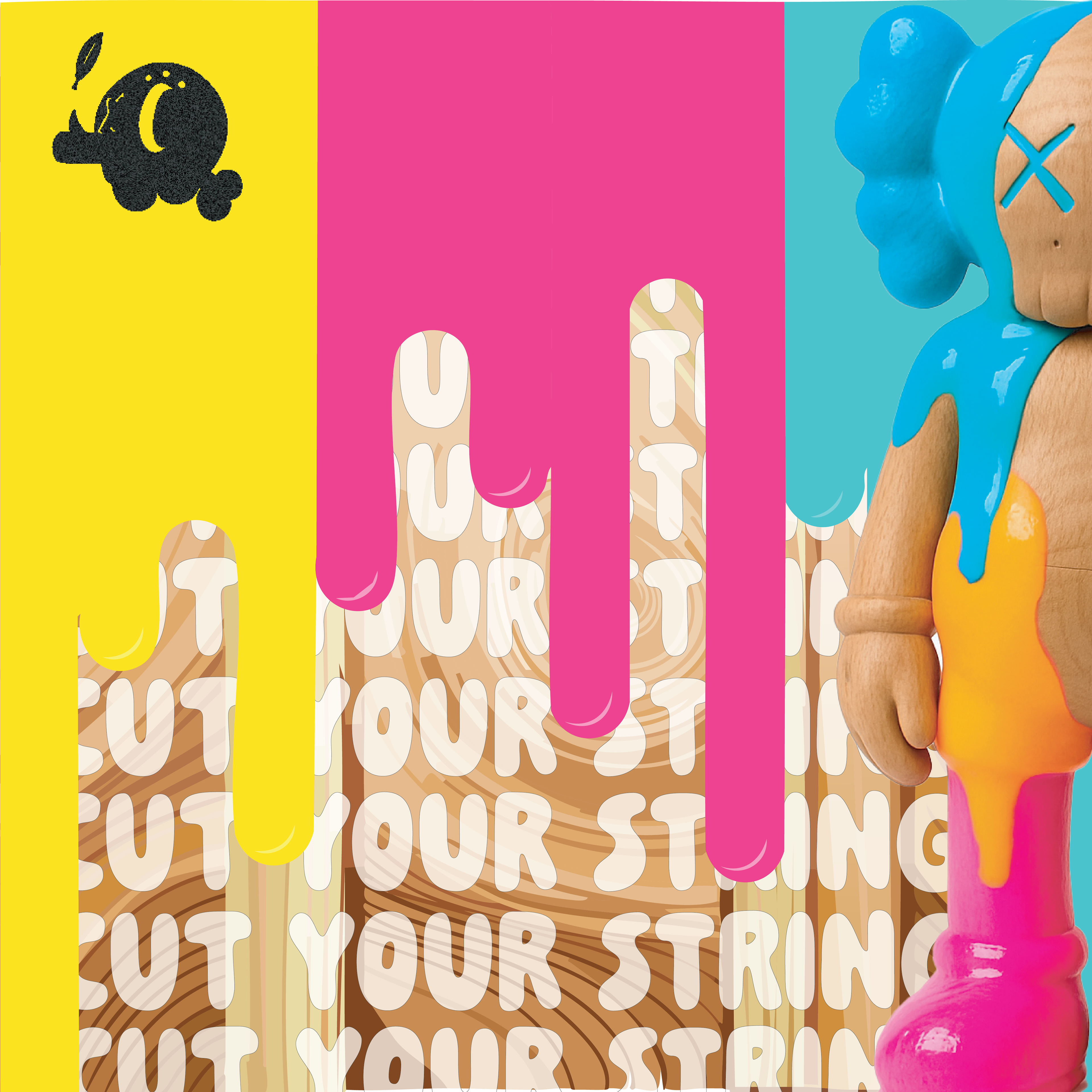
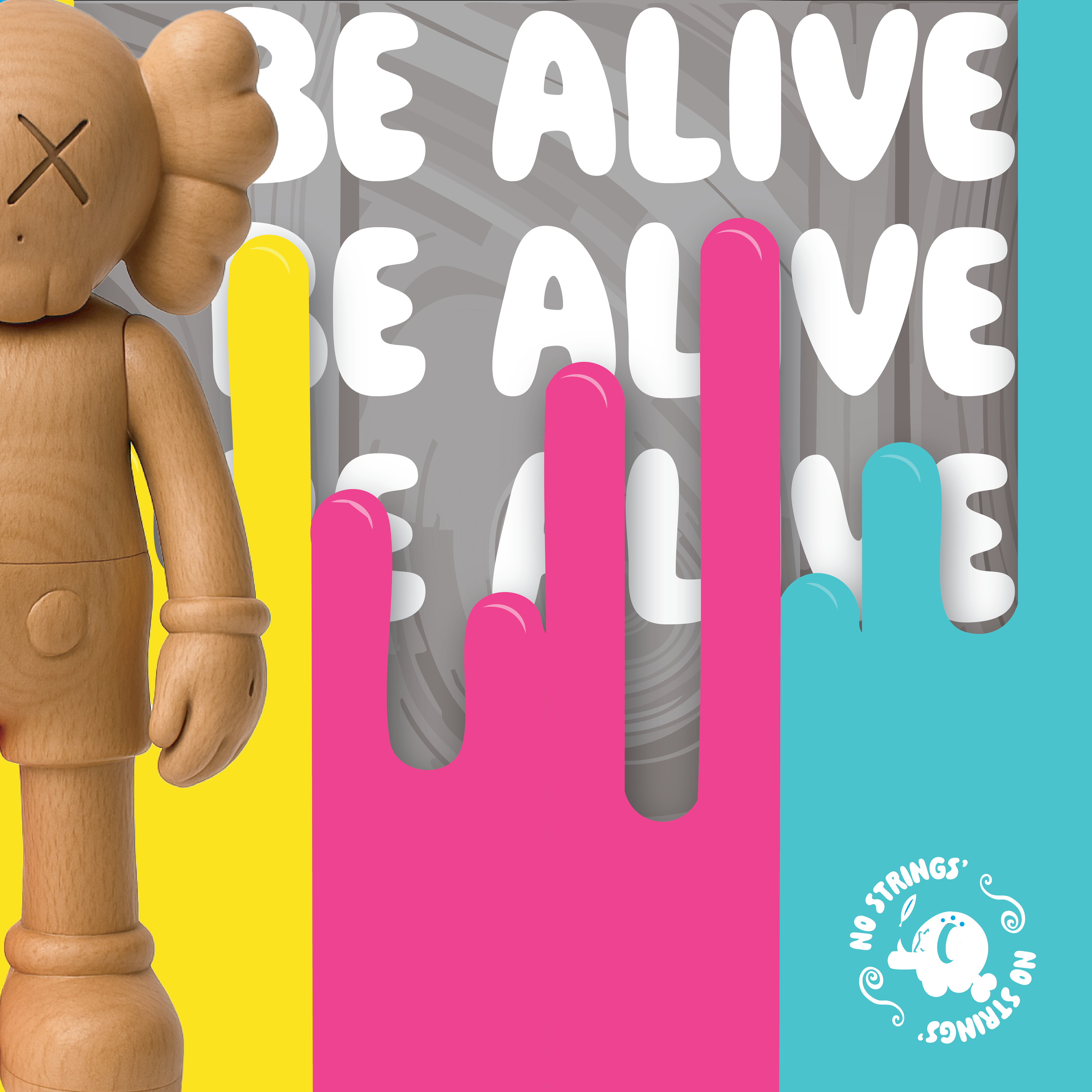
Early style concepts emphasized a refined look, featuring wood grain patterns, fine line detailing, and restrained splashes of color to convey a sense of elegance. It worked, but it didn’t sing. Once we considered the audience, we flipped the script. Out went subtlety, in came boldness. We pushed typography louder, layered in color-heavy assets, and made sustainability and craft part of the visual language. The result? A pop-inspired aesthetic that speaks directly to younger micro-luxury audiences who want their purchases to feel as vibrant and one-of-a-kind as the toys themselves.
Brand Playbook
A brand this mischievous still needs a game plan. The playbook outlines how No Strings presents itself in the world—from limited-edition drops to collaborations with pop culture icons. It’s part strategy, part storytelling, and part ‘don’t take yourself too seriously.’ Think of it as the secret manual that keeps No Strings from turning into just another toy company, making sure it stays an art-driven movement instead.
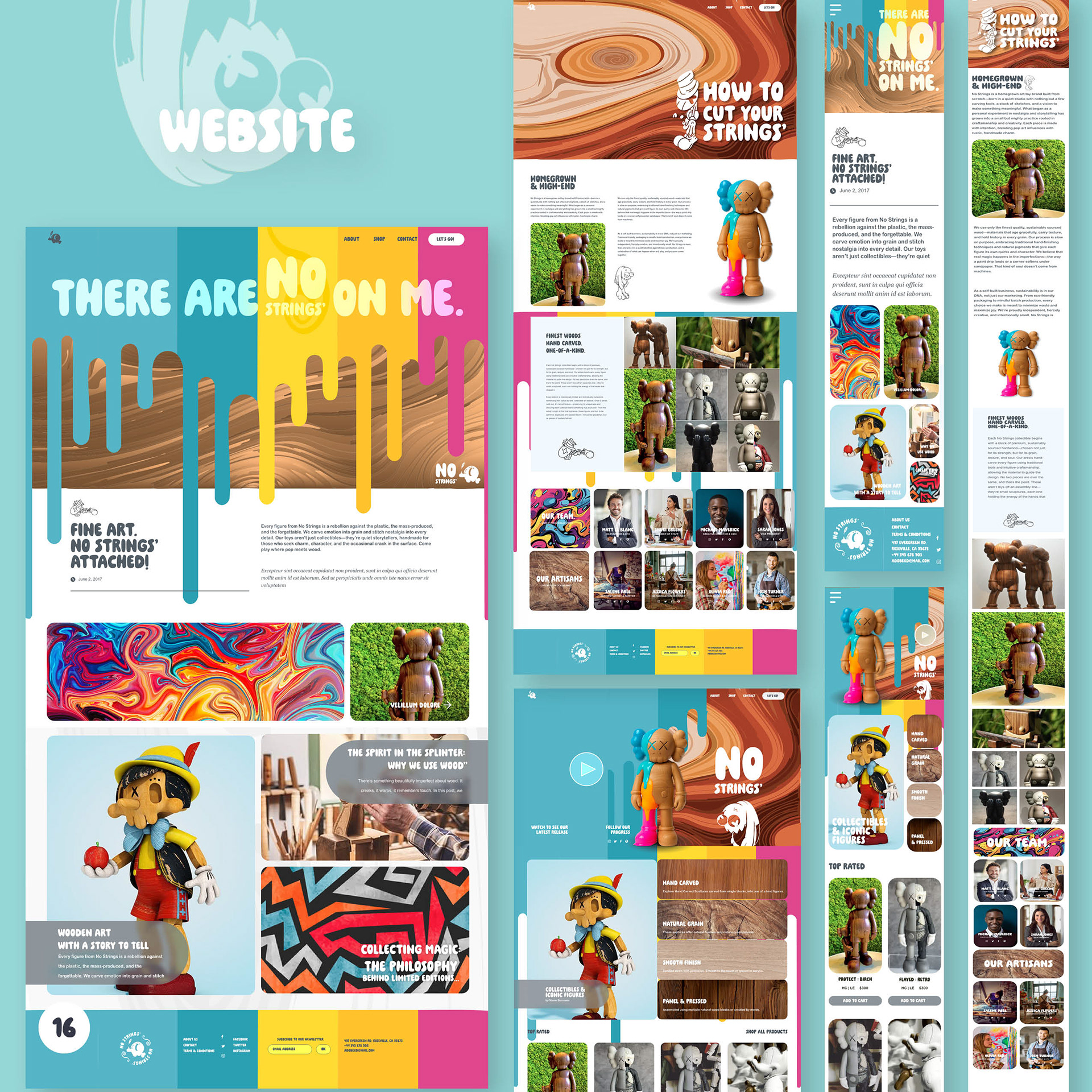
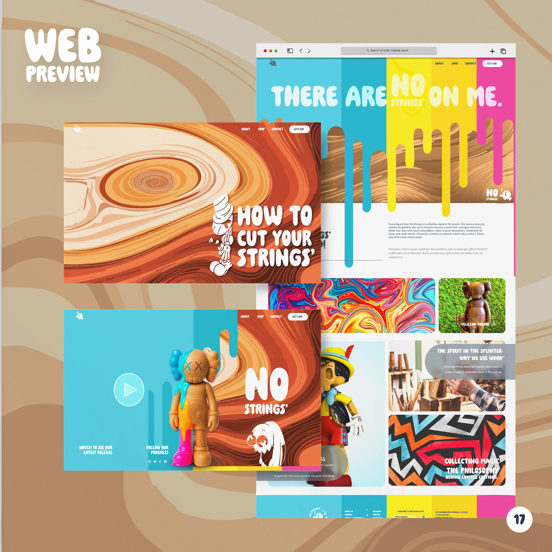
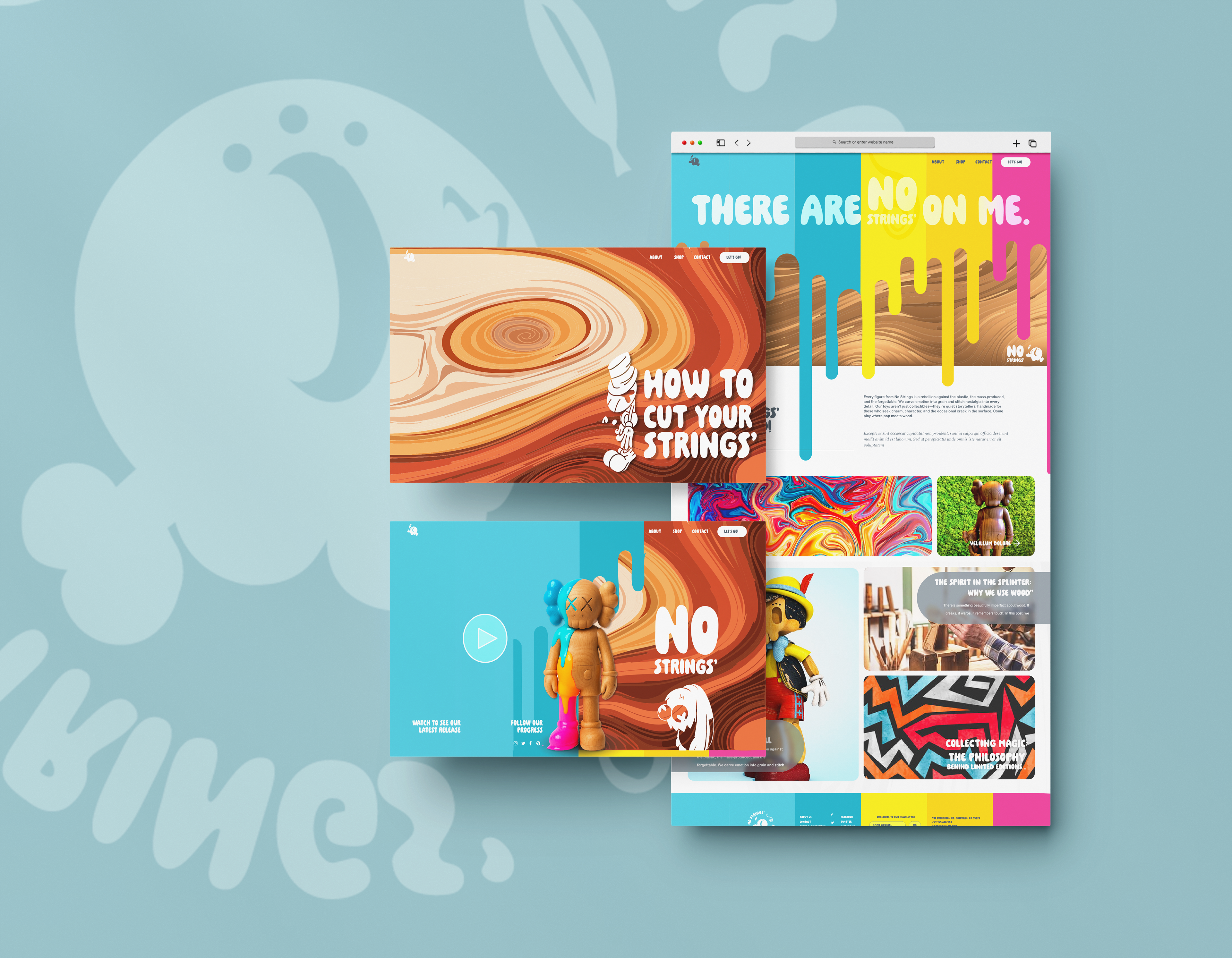
Website
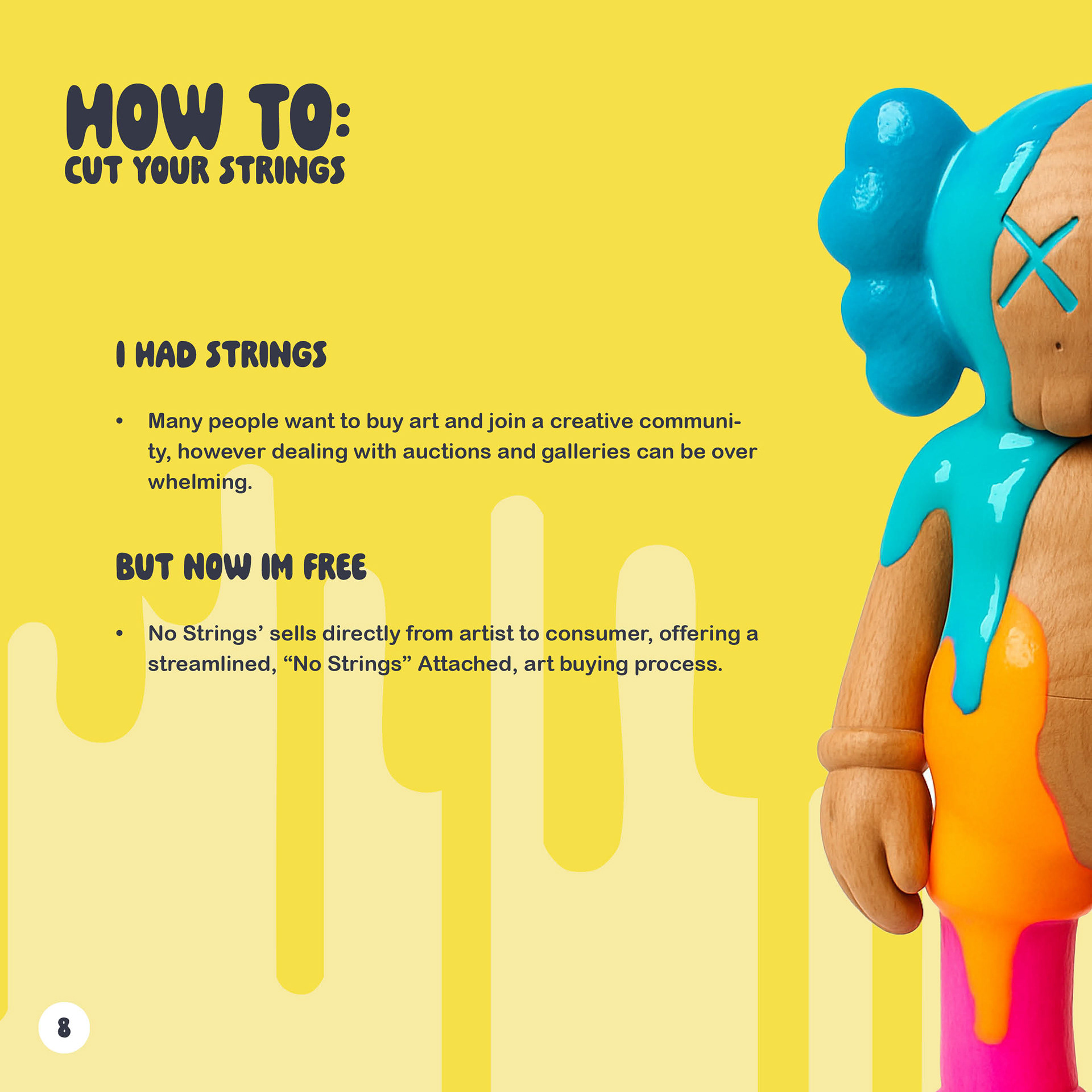
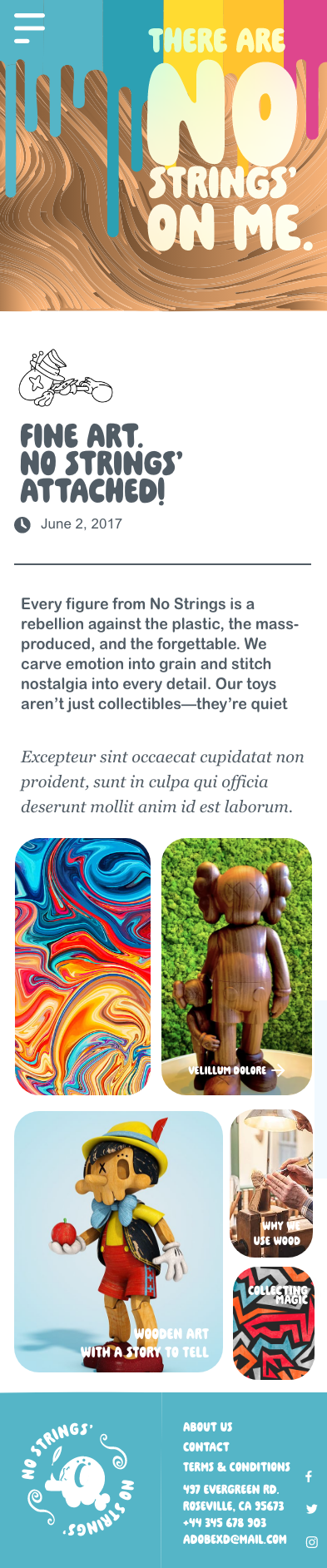
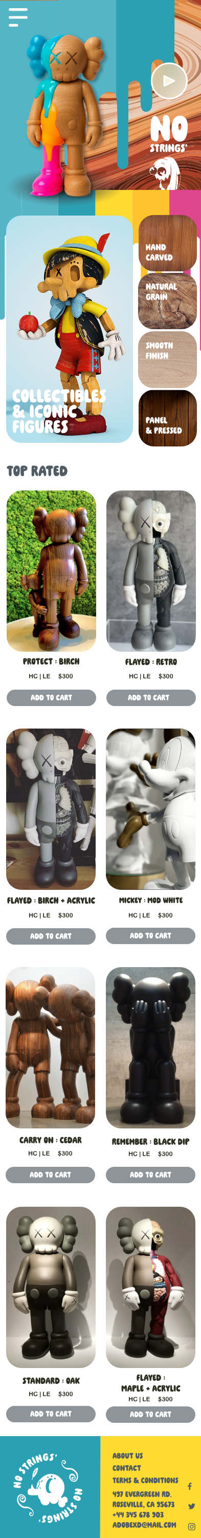
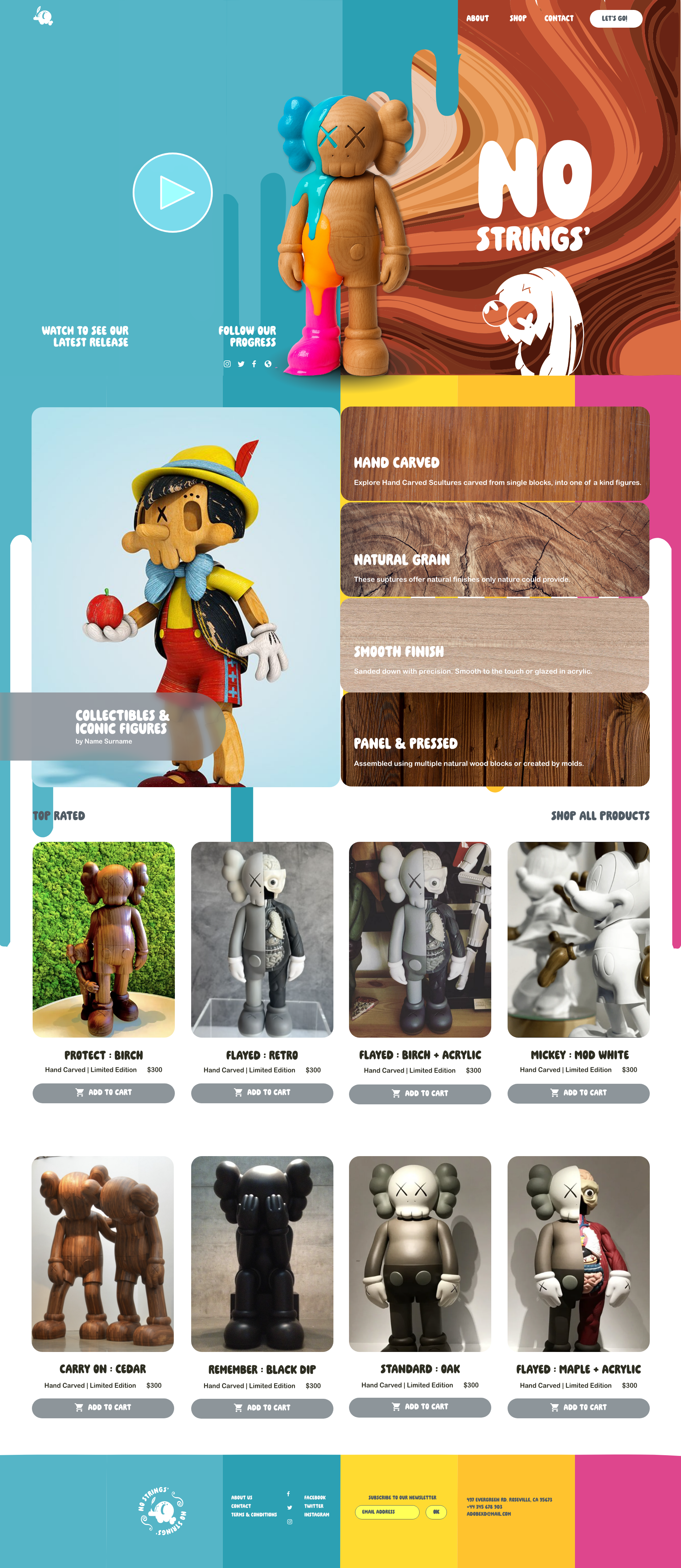
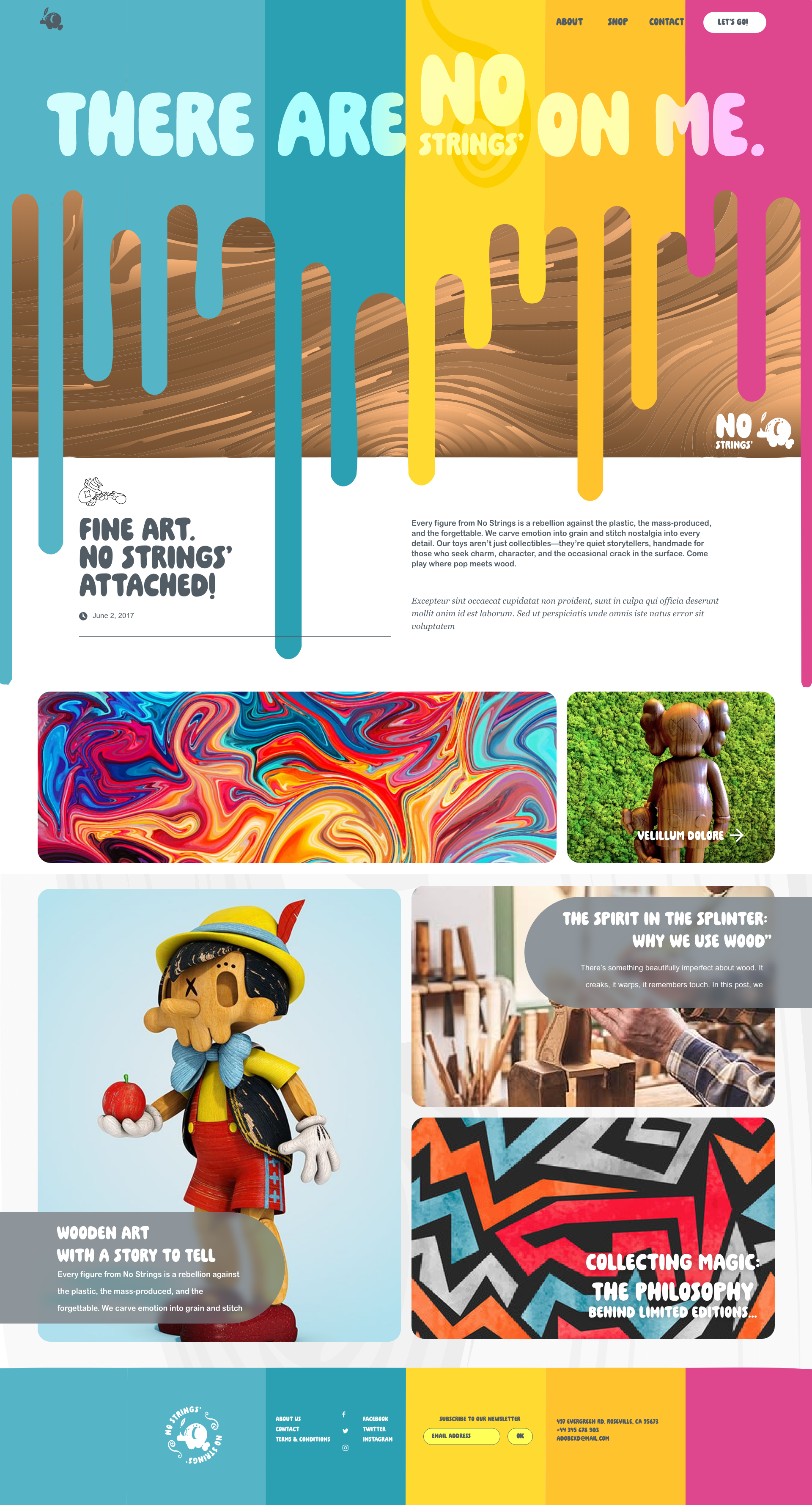
The No Strings website is where the brand comes alive. It’s fun, energetic, and unapologetically product-forward. Every page is built to put the toys in the spotlight, because when you’re working with handcrafted wooden figures, they deserve to take center stage. The design leans into clashing colors that shouldn’t work but do, creating a bold and memorable experience. Those solid tones frame the rich complexity of the wood grain, letting every figure’s quirks and textures pop off the screen. It’s not just a shop, it’s an interactive gallery for play and collectibility.


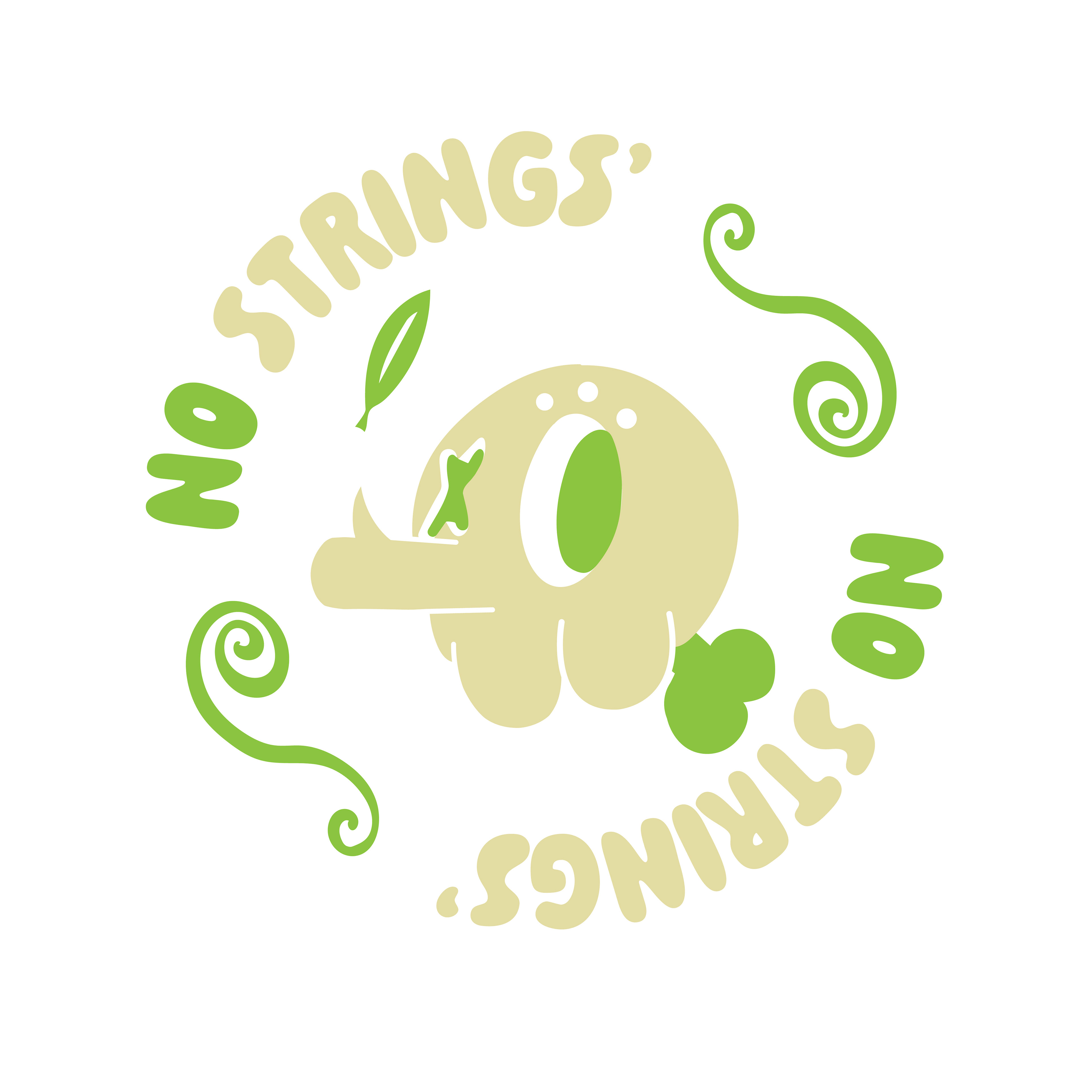
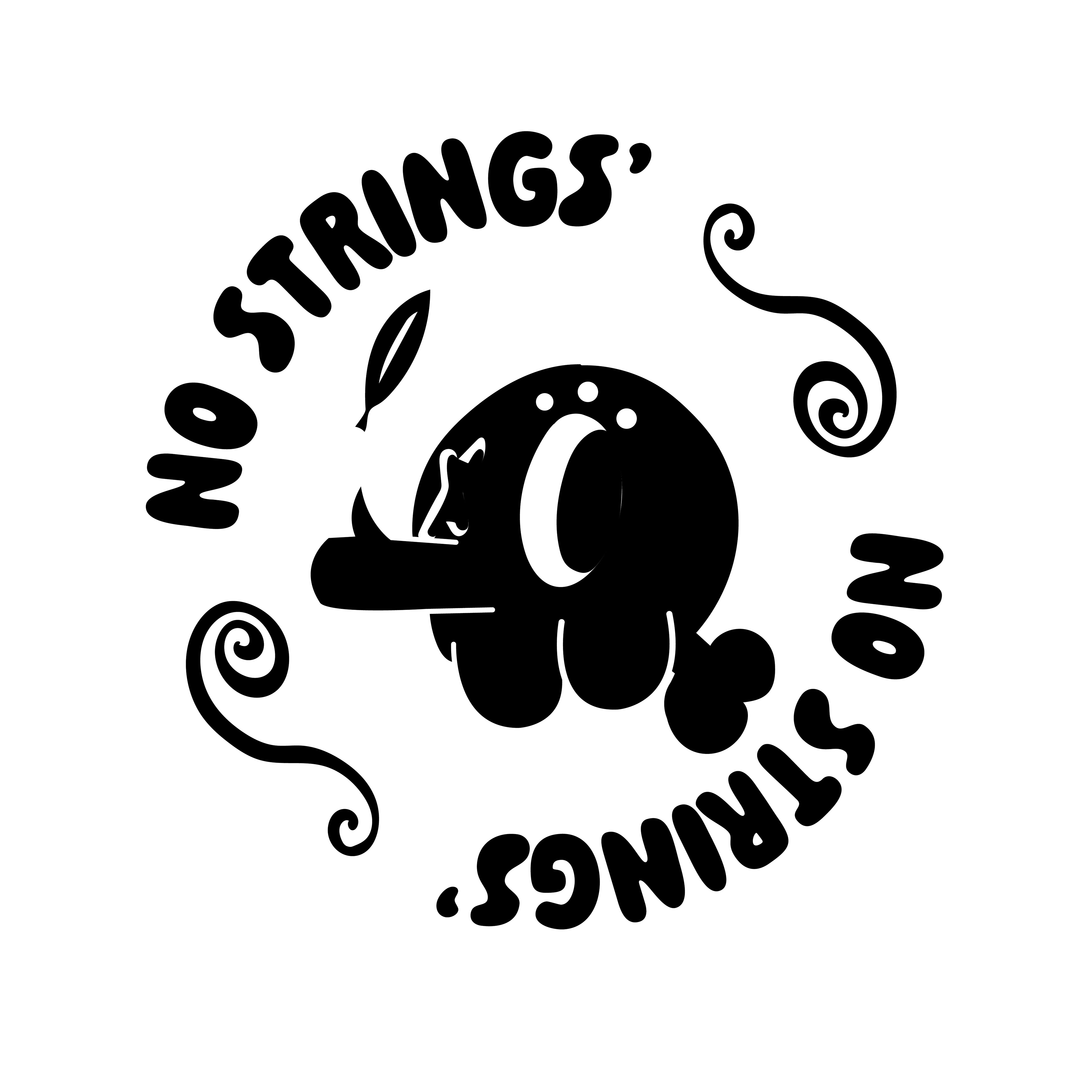
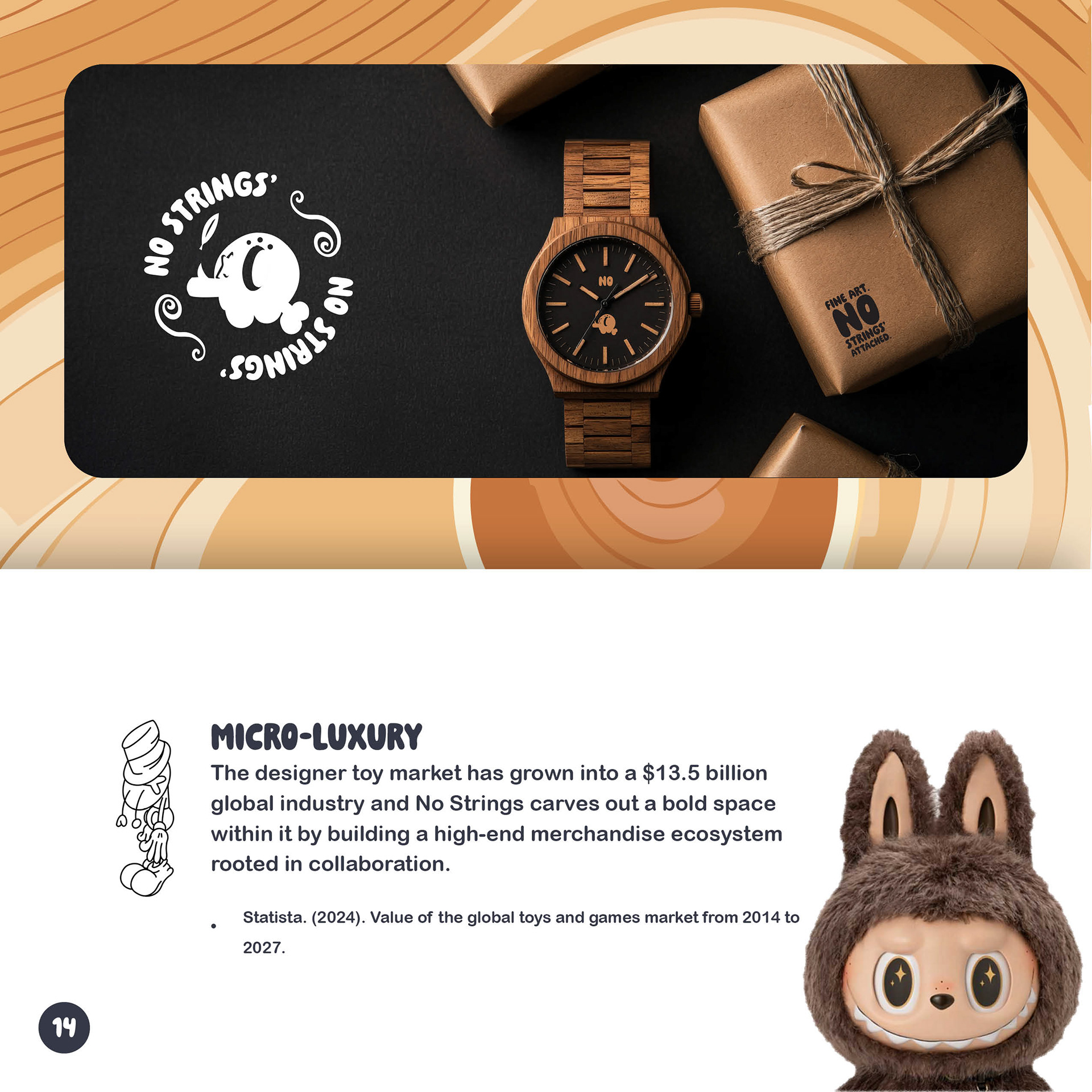
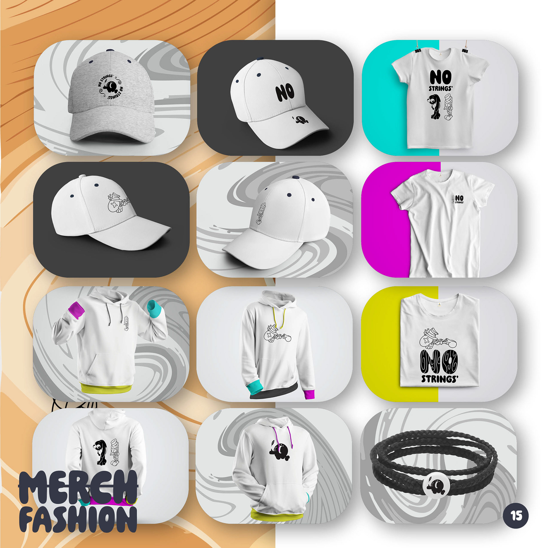
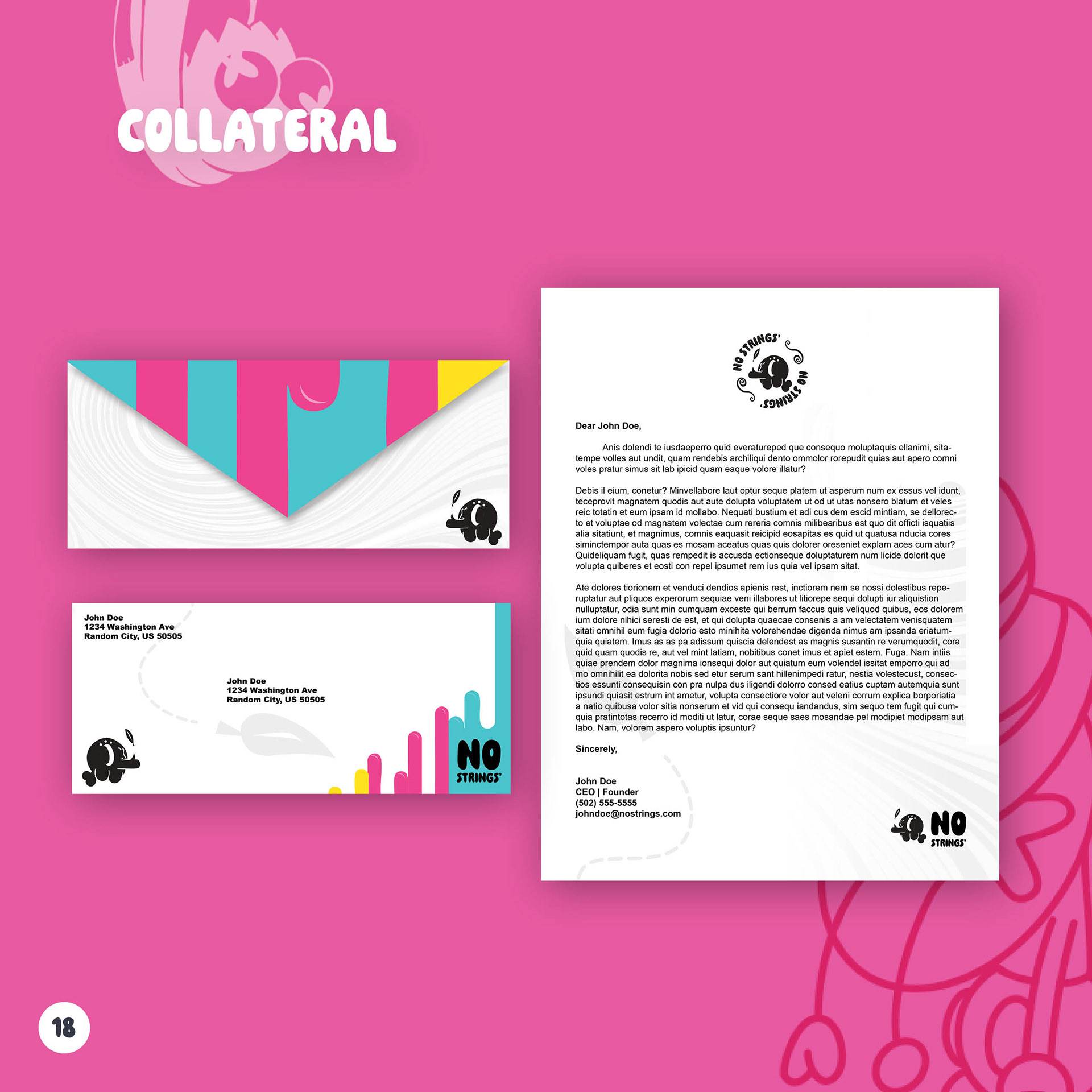
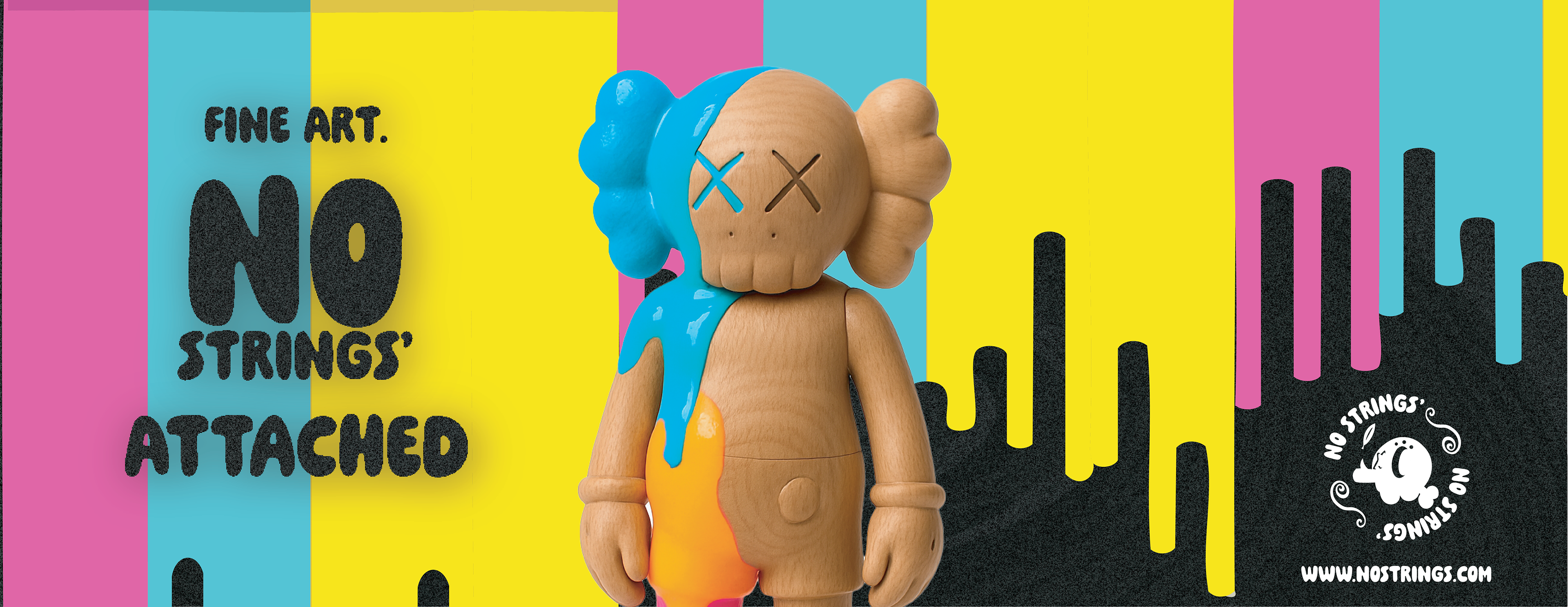
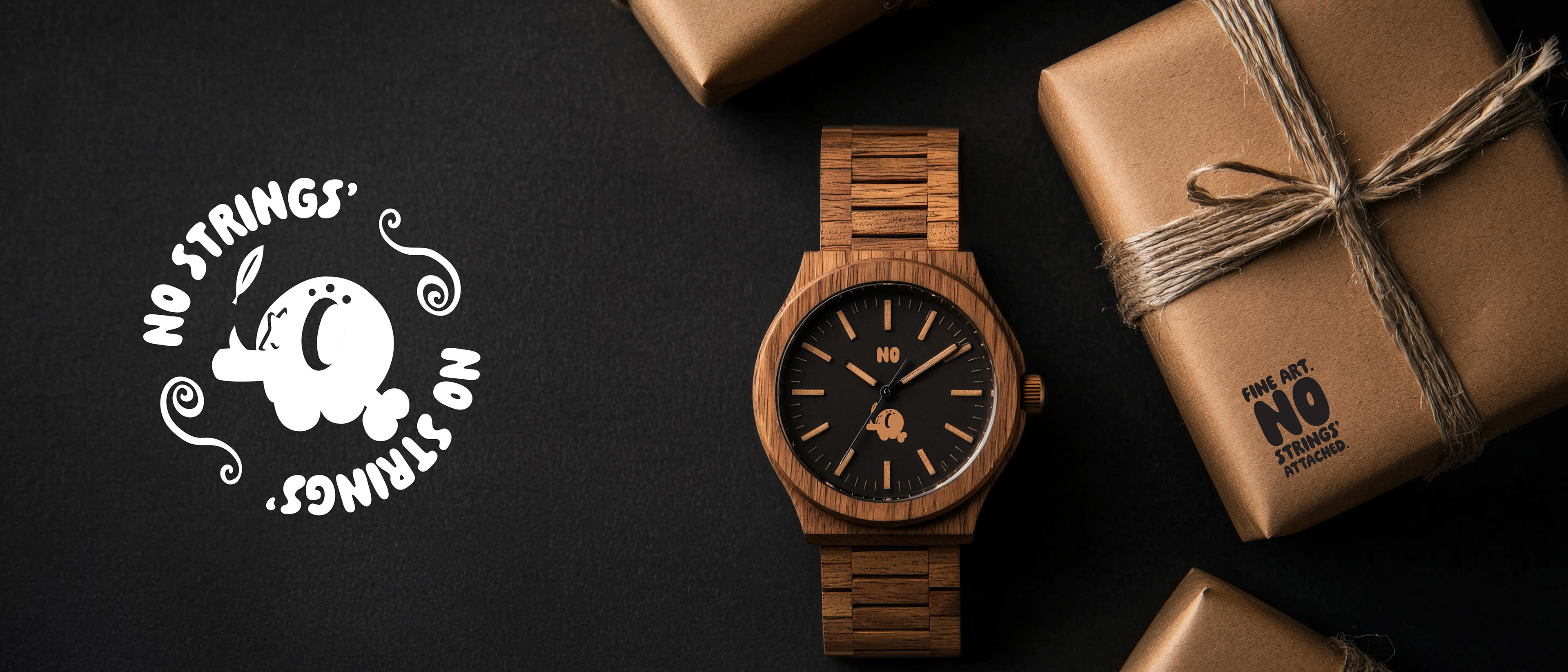
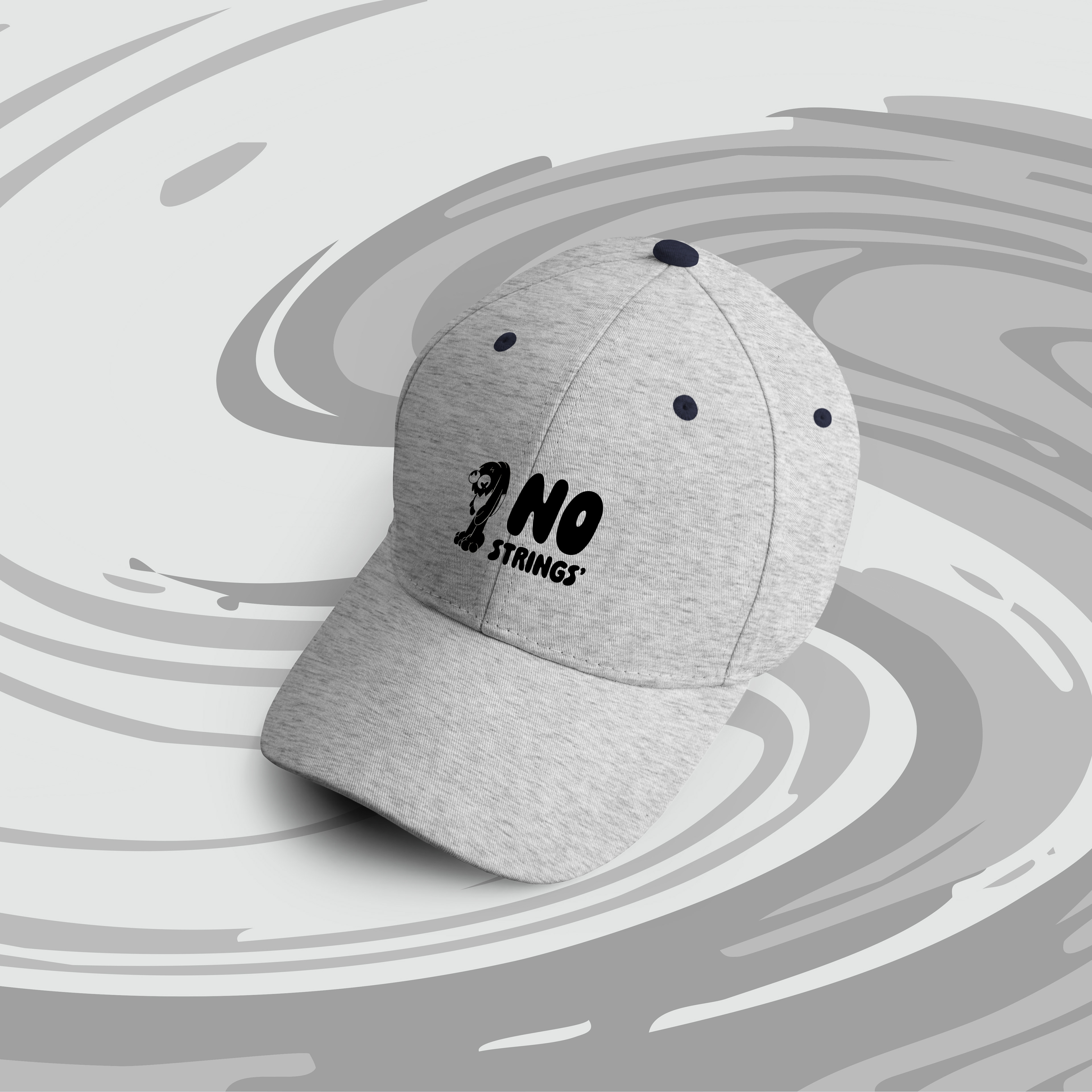
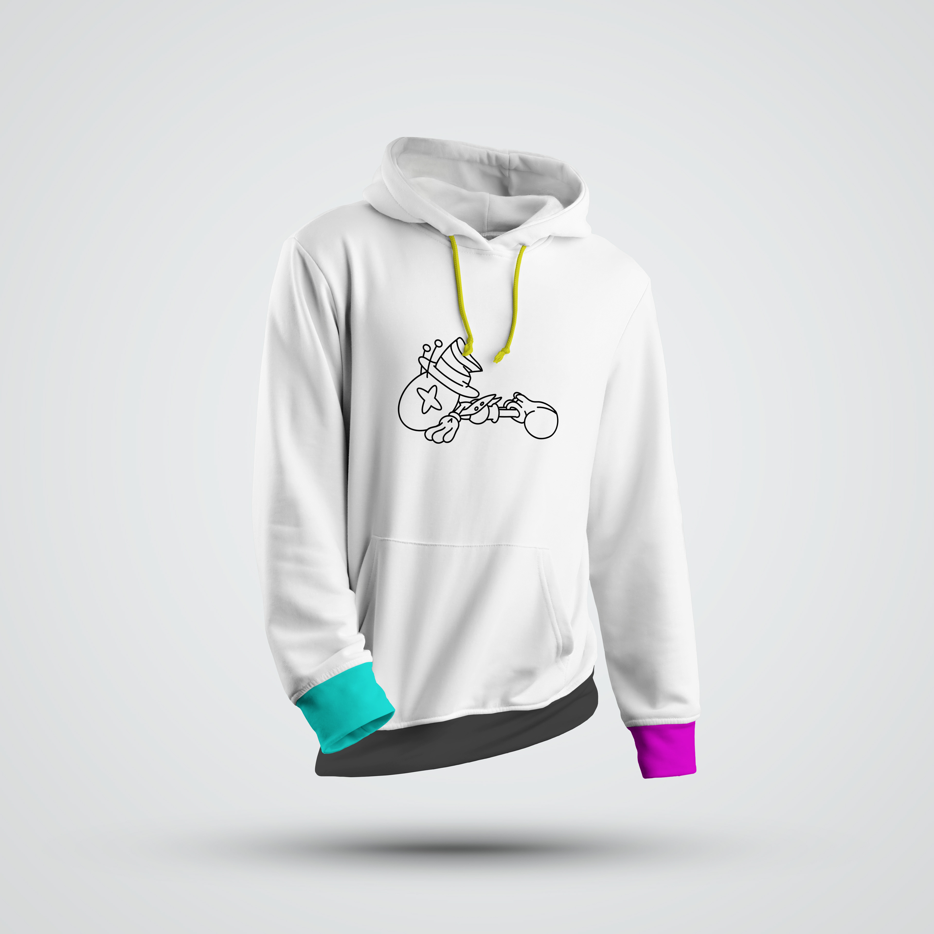
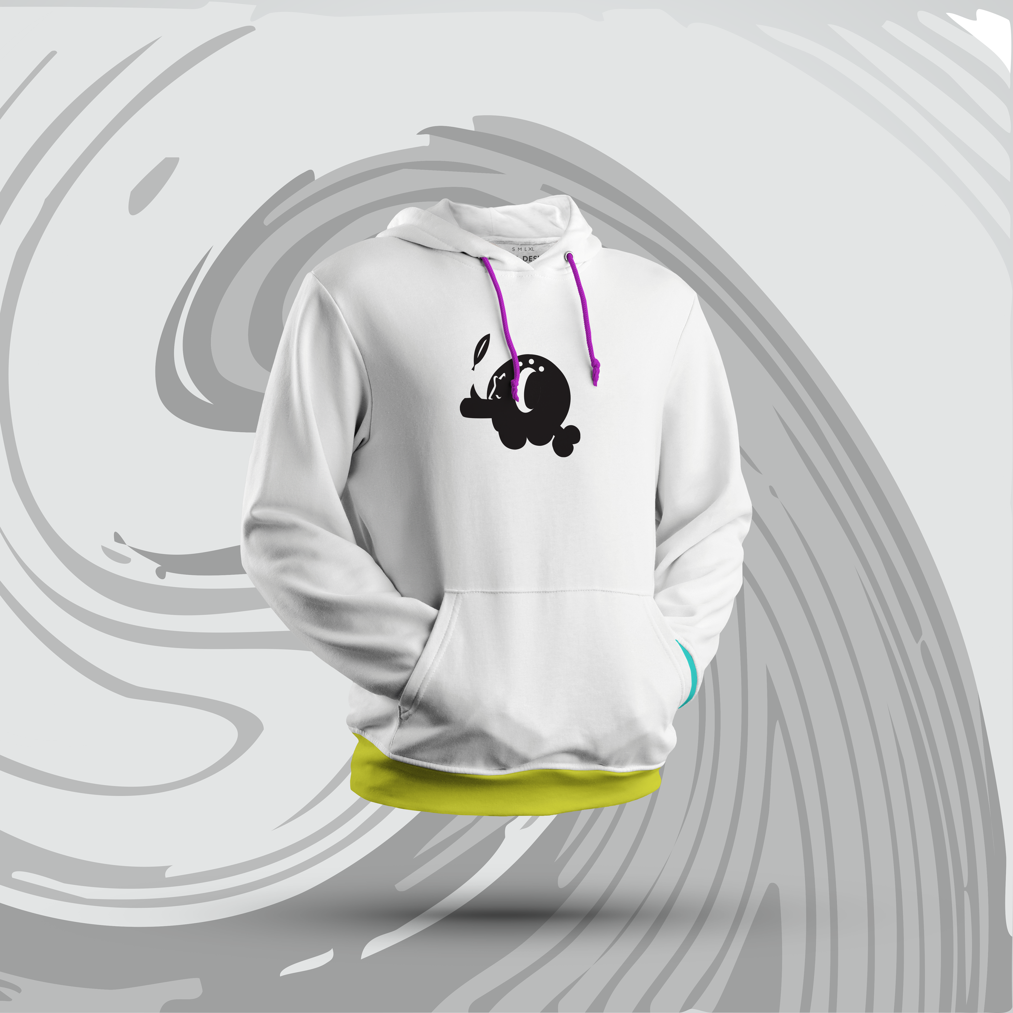
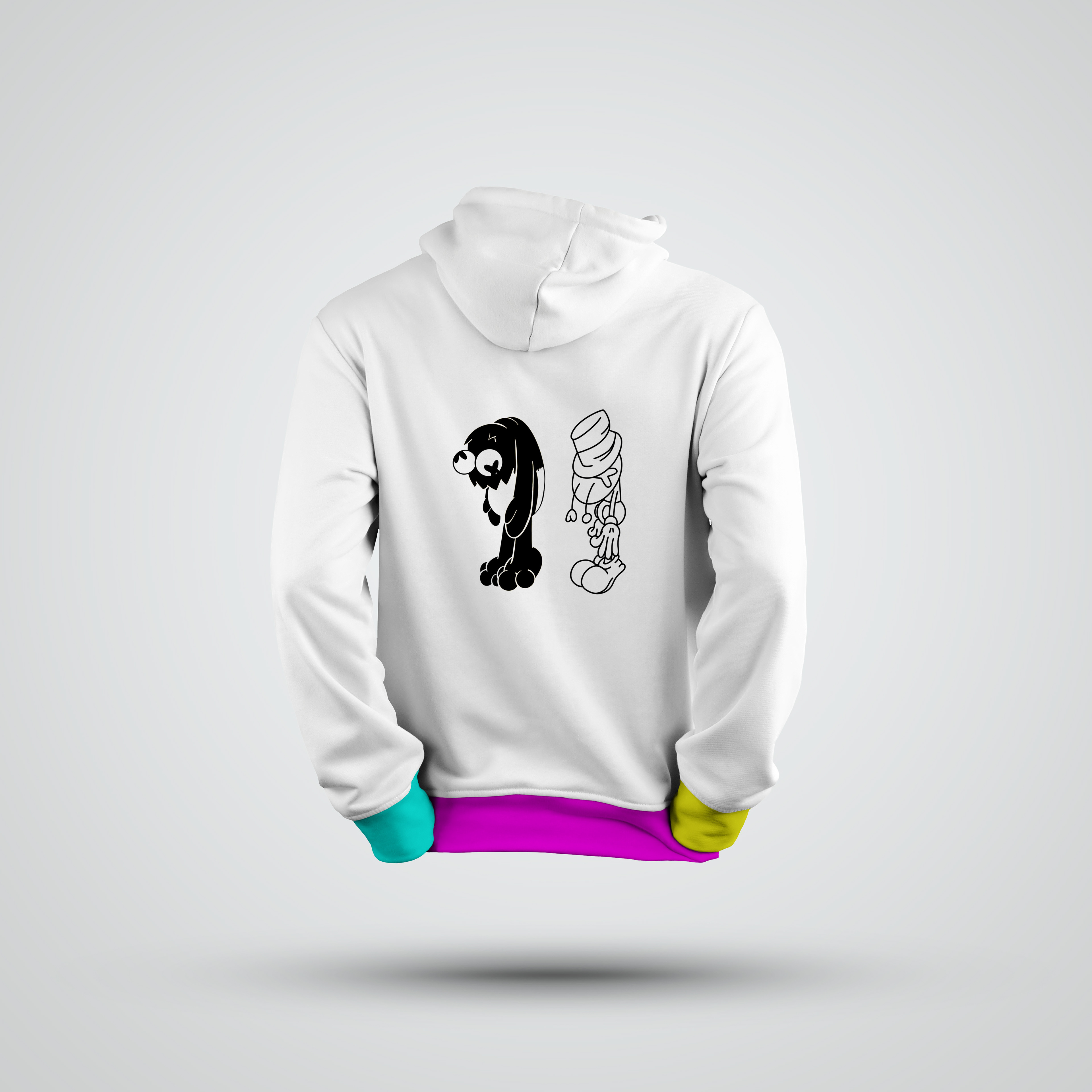
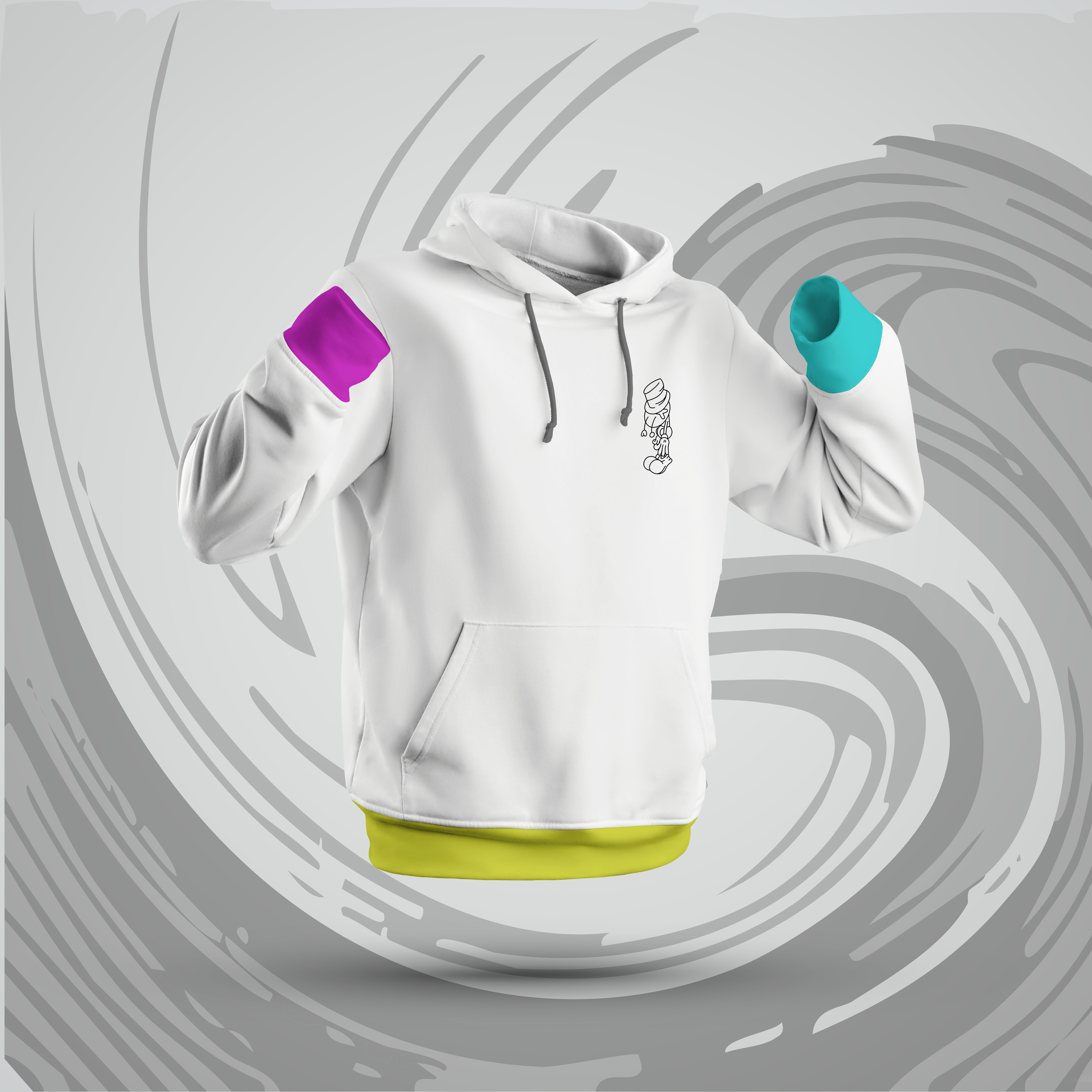
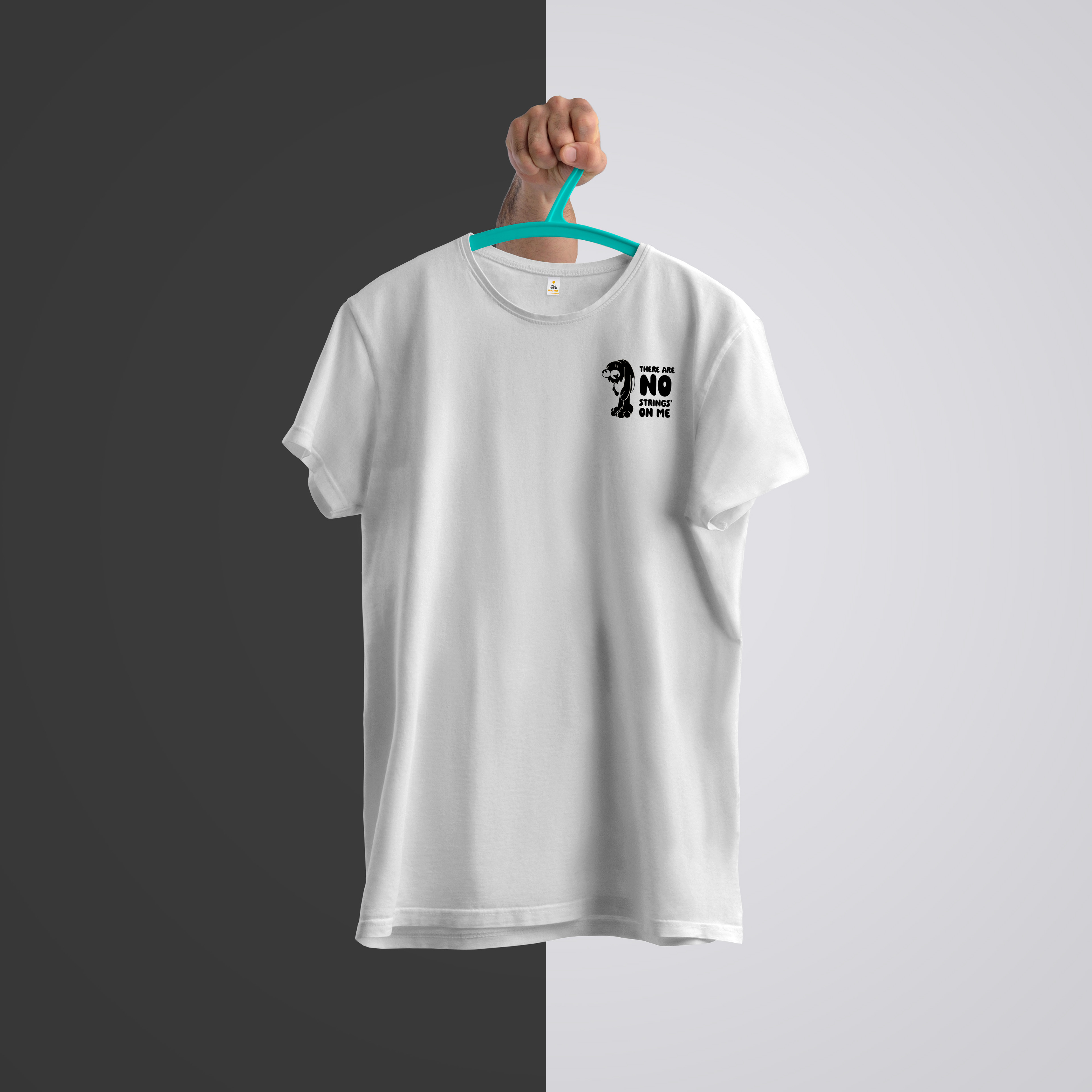
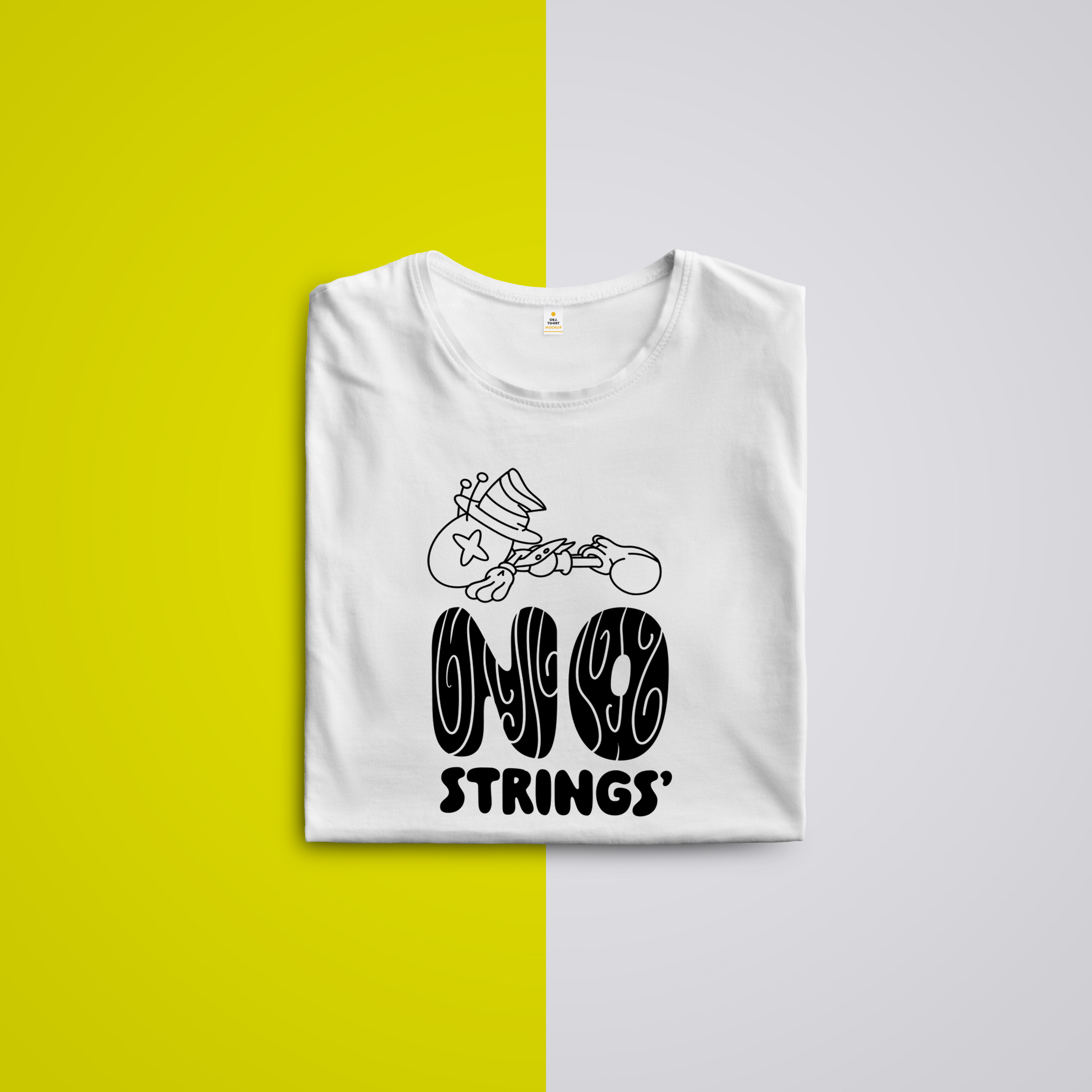
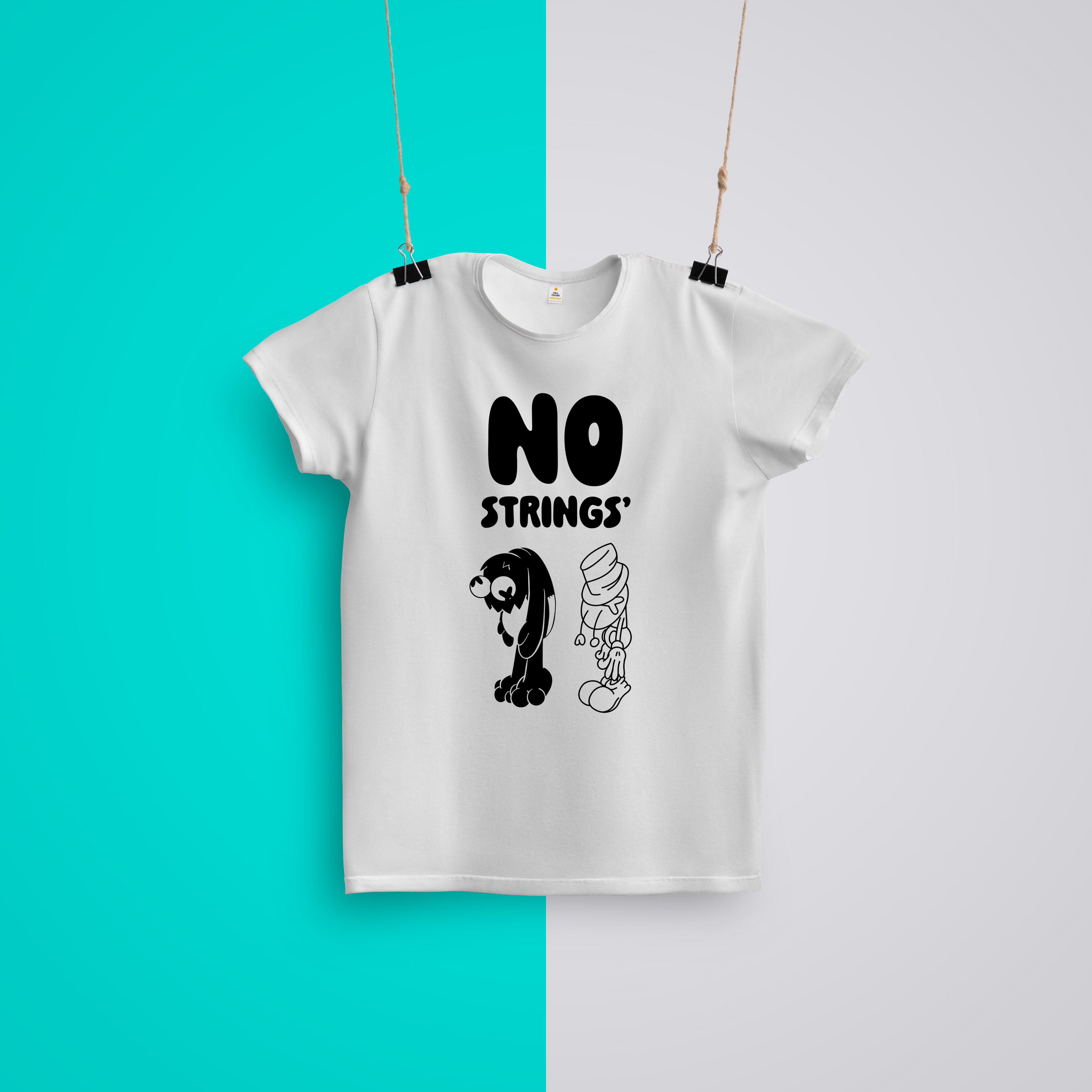
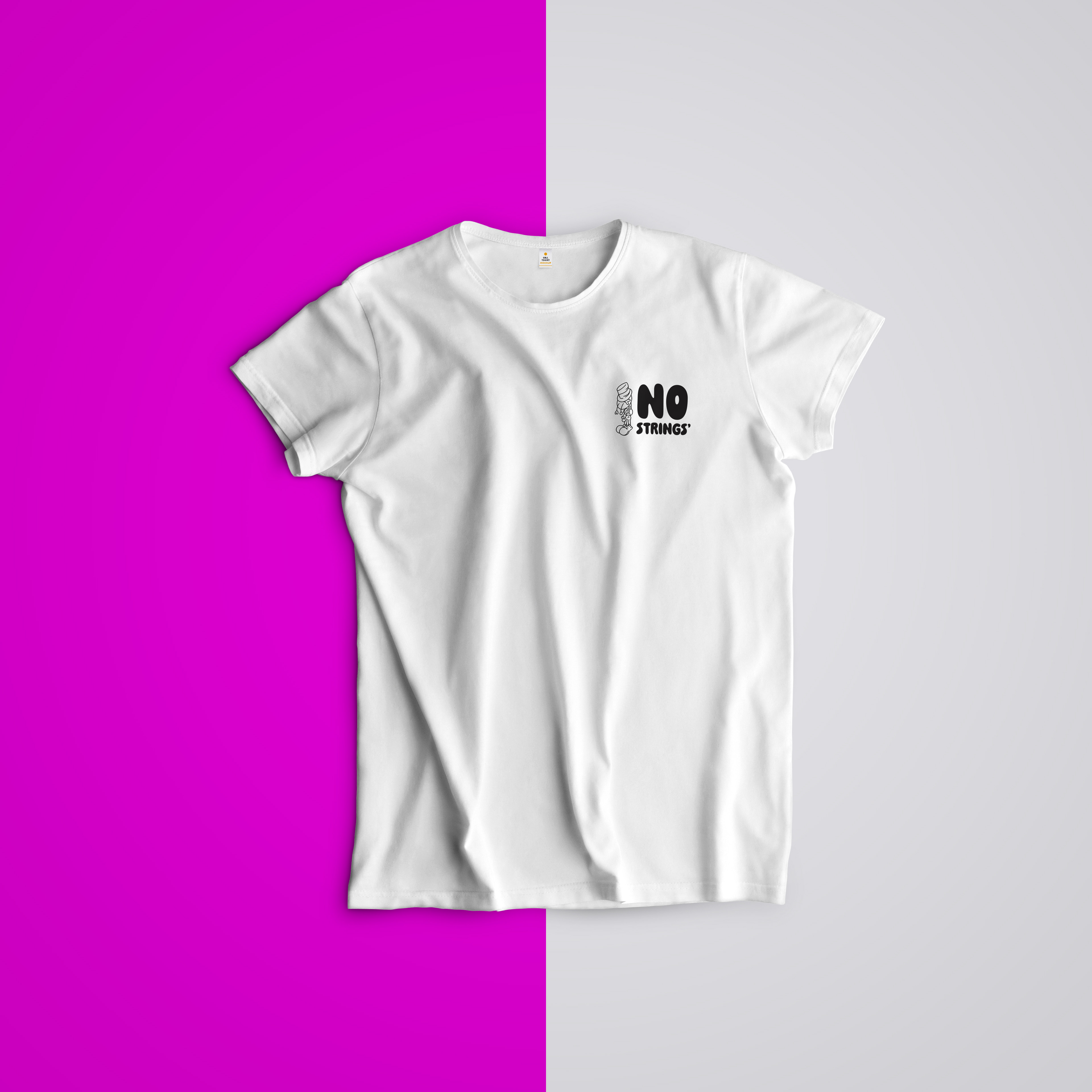
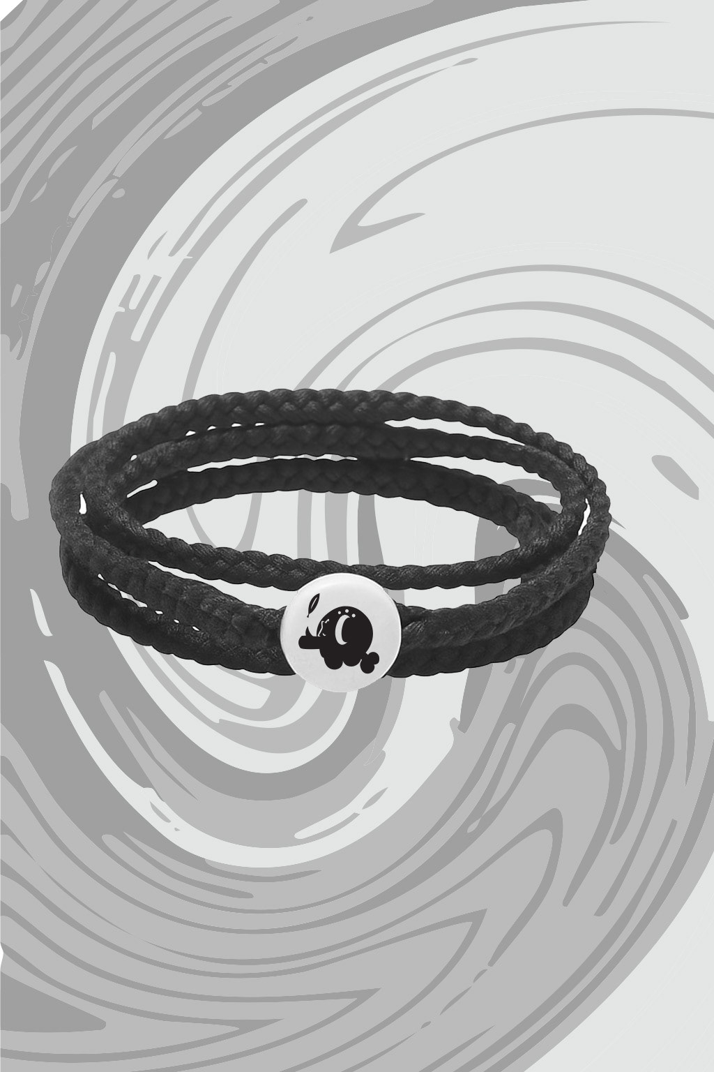
Marketing Assets
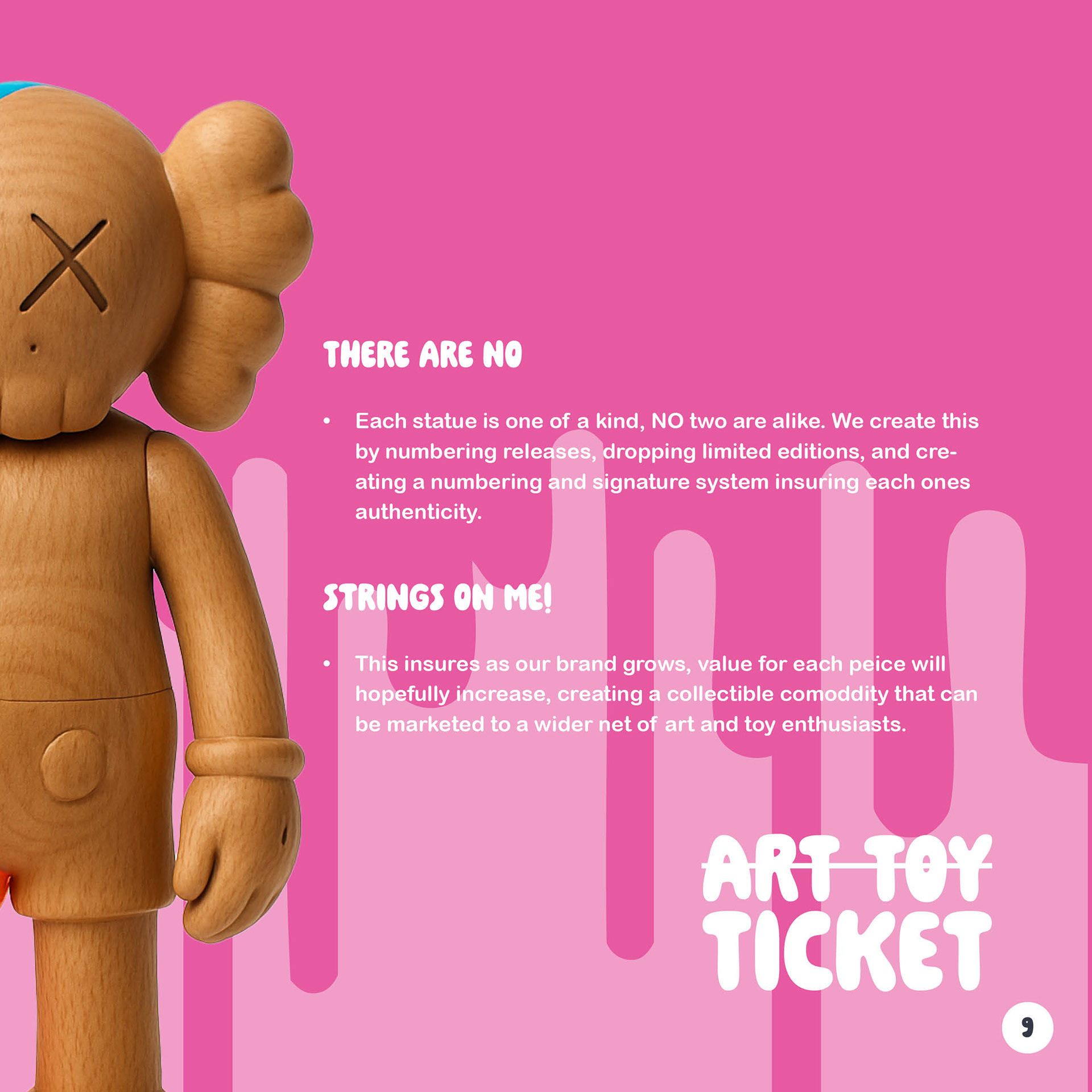
No Strings comes alive through its assets: packaging that feels like unwrapping treasure, animated logos that wink at you, social media templates that shout without screaming, and merch that makes you grin. Each asset was designed to carry the brand’s DNA, nostalgic, rebellious, and handcrafted, while still leaving room for play. Because if the assets aren’t fun to make, then they aren’t No Strings.


Conclusion
No Strings isn’t just about toys; it’s about reimagining what a toy brand can be. By blending nostalgia with rebellion, craft with pop art, and structure with play, the brand carves out its own lane in a crowded market. From the logo to the website, every element was designed to feel handcrafted yet bold, collectible yet approachable. The result is a brand that celebrates imperfection, sparks curiosity, and invites audiences to be part of something more than just a purchase. No Strings proves that when you strip away the
corporate gloss and lean into honesty, fun, and craft, you get a brand worth collecting.
Link To Thesis Site: https://thekmac0.wixsite.com/my-site