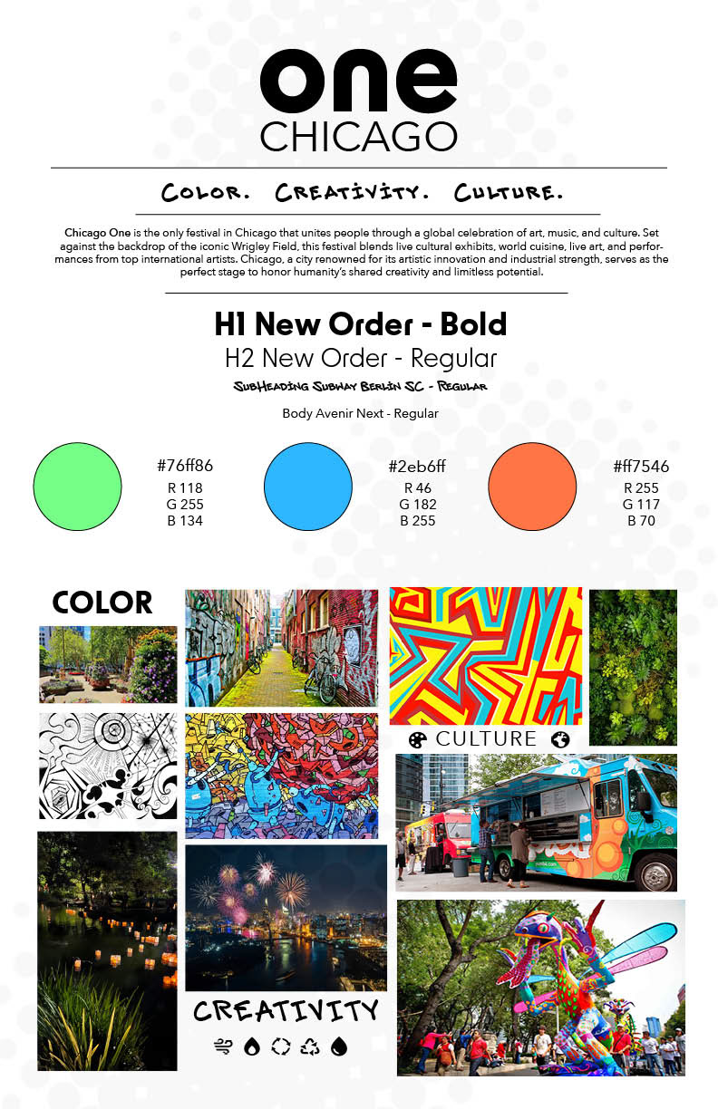
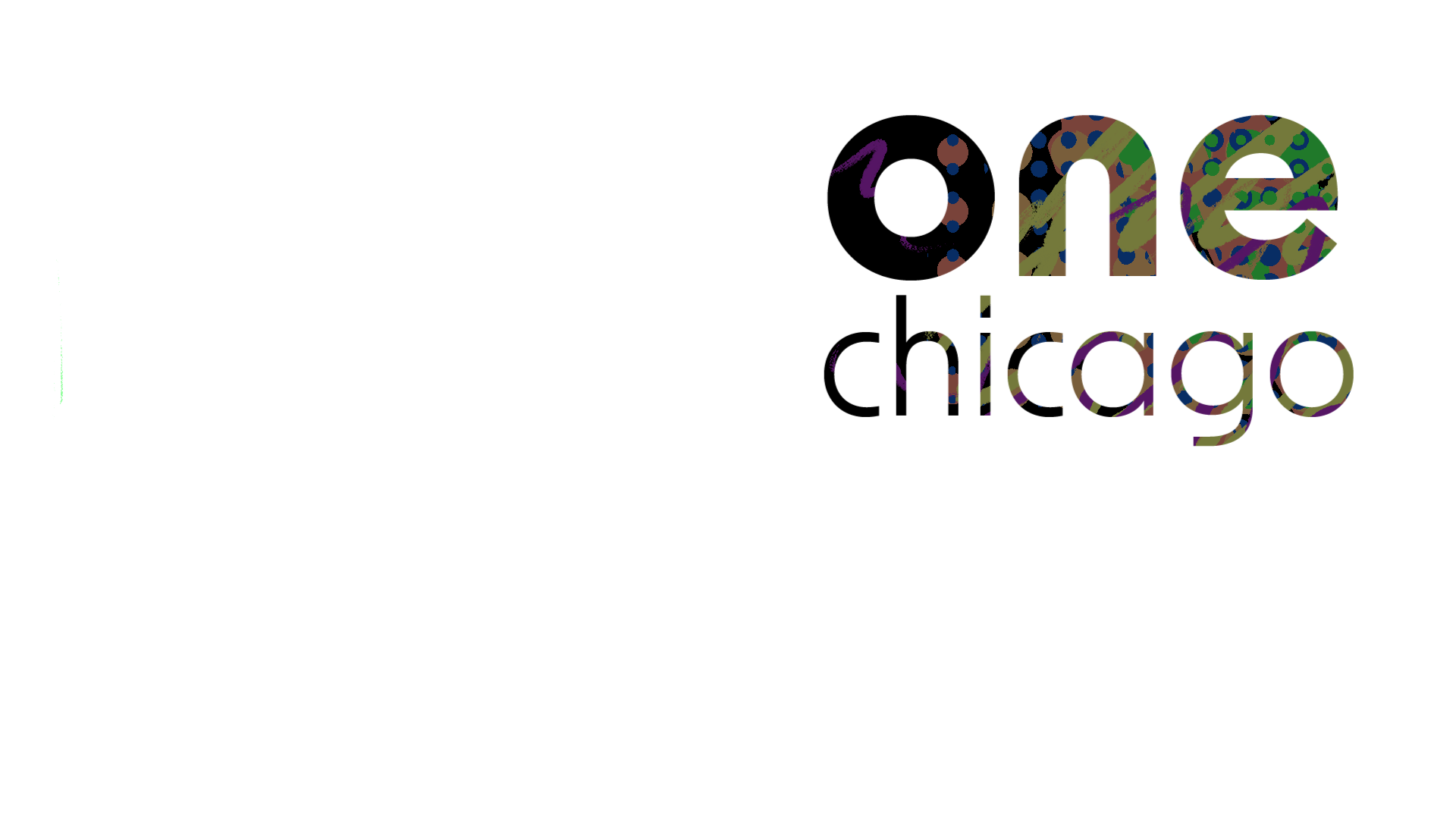
One Festival: Chicago
The One Chicago Festival was developed as a branding experiment focused on one goal: understanding how sound and visuals combine to leave a lasting impression. The assignment challenged me to create a system where sight and sound are inseparable, working together to spark emotion and build recognition. By exploring rhythm, tone, and visual storytelling, the project showcases how a brand can resonate far beyond its logo, it can become an experience.
Style Guide
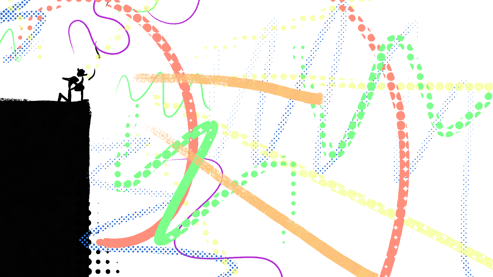
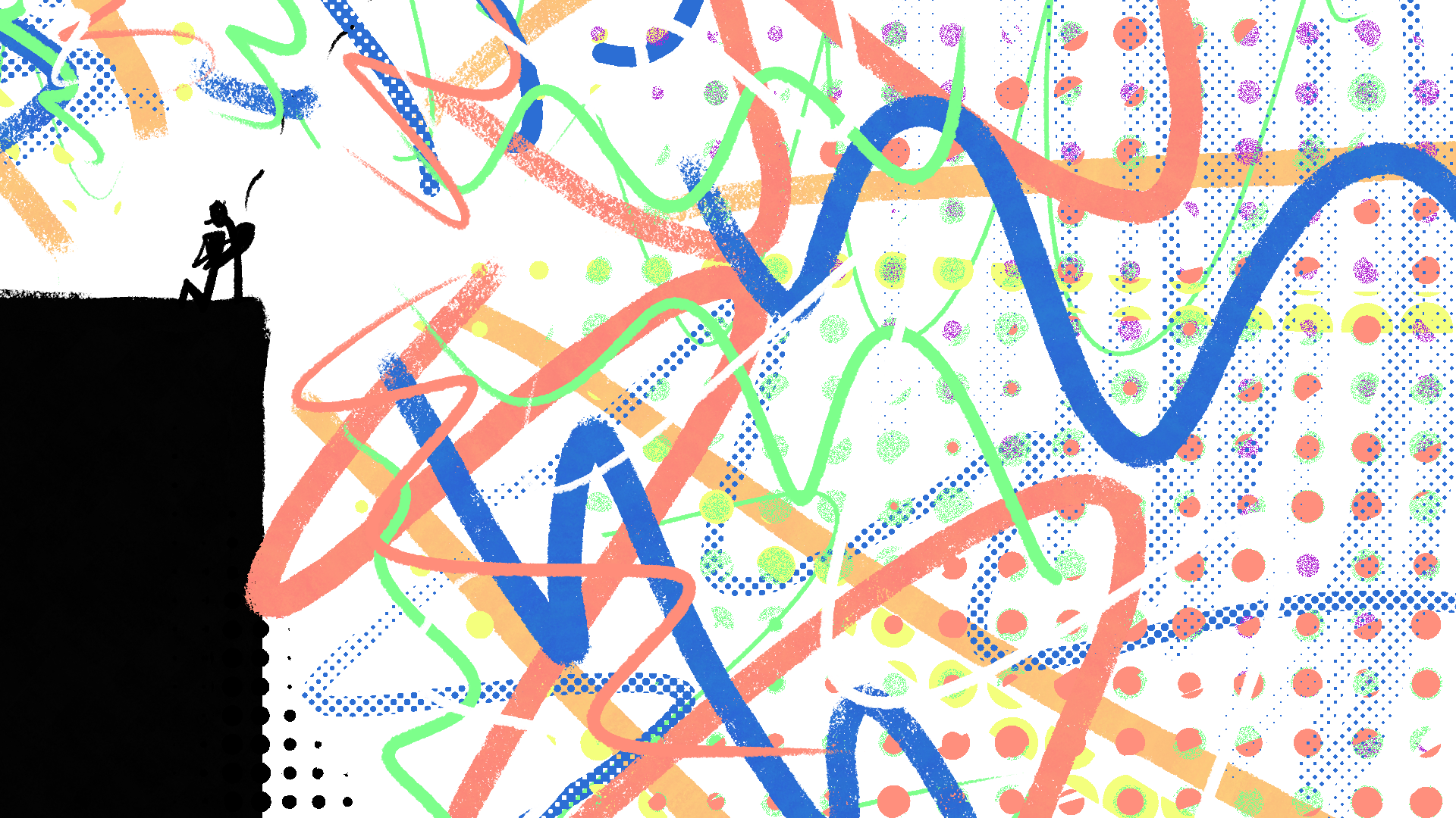
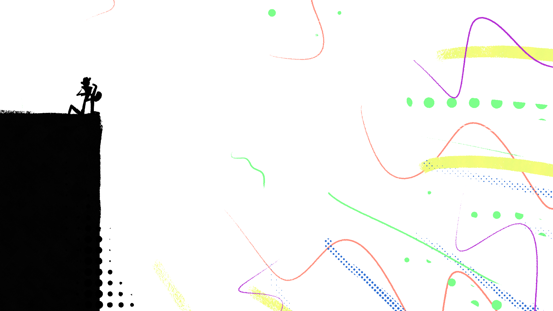
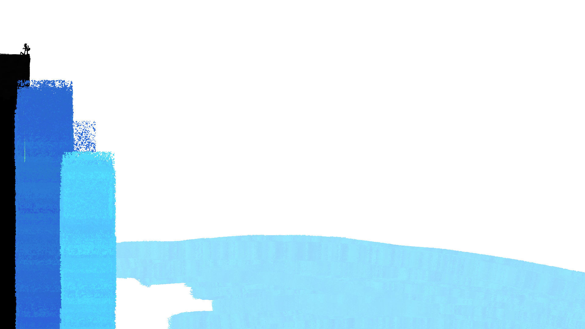
To anchor the project, I built a style guide that kept sound in mind as much as visuals. Colors were bold and clashing, chosen to mirror the energy of layered beats. Typography was heavy, direct, and rhythmic, matching the pulse of the audio cues. The result is a guide that doesn’t just set rules for consistency, but one that ensures visuals and sound harmonize to create a unified brand voice.
Sound Design Meets Visual Design
This section was about bridging two creative languages. Just as a color palette defines mood, sound design defines presence. I explored how deep bass paired with bold color fields creates intensity, while lighter tones paired with softer imagery convey warmth and approachability. By intentionally syncing audio identity with visual identity, the brand moves from being something you see to something you feel.
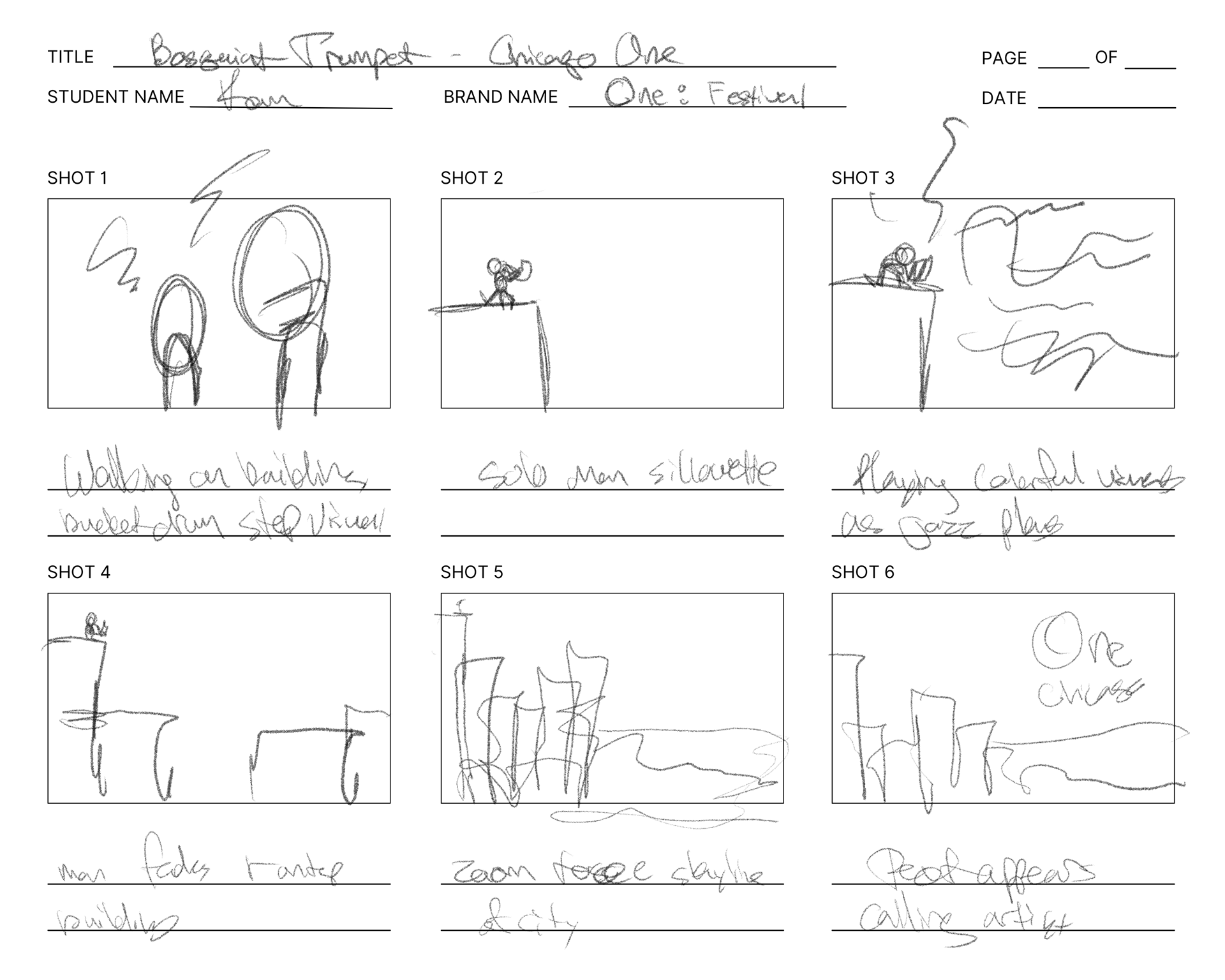
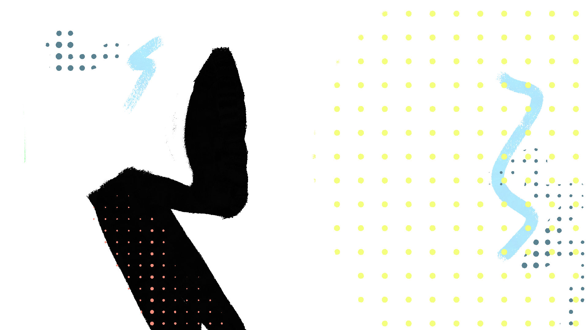
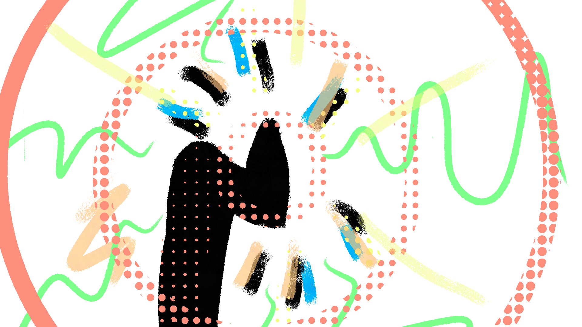
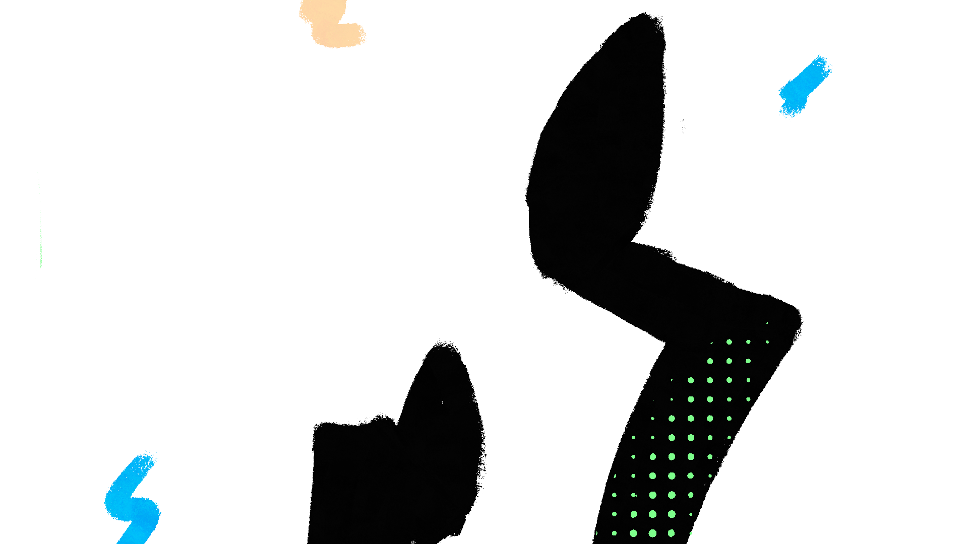
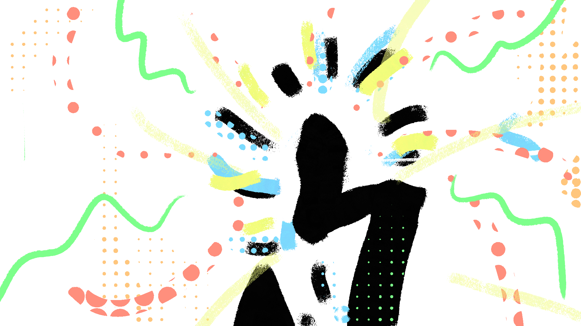
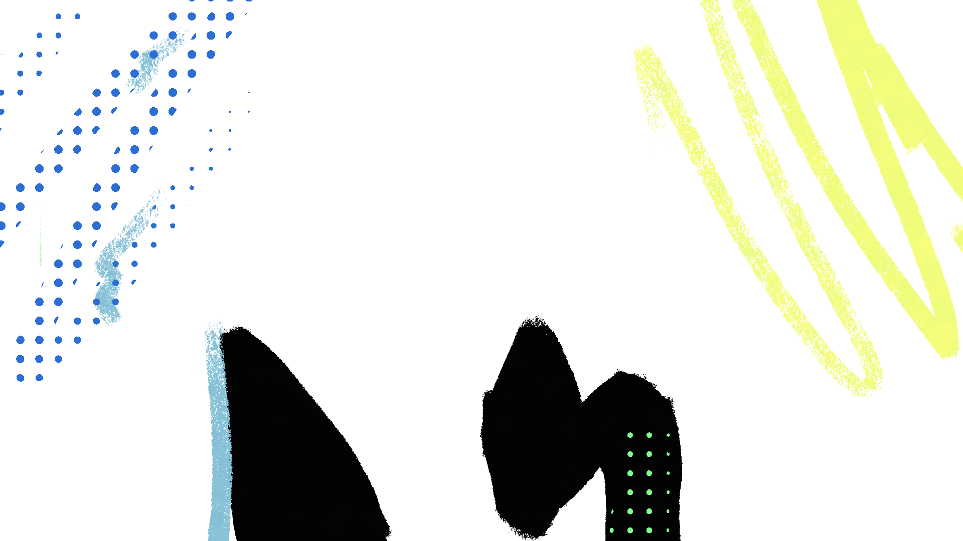
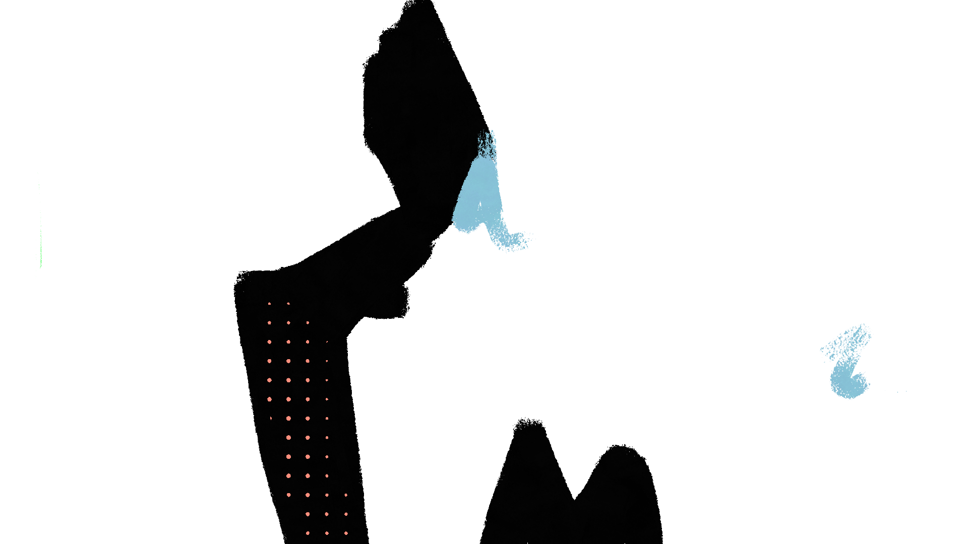
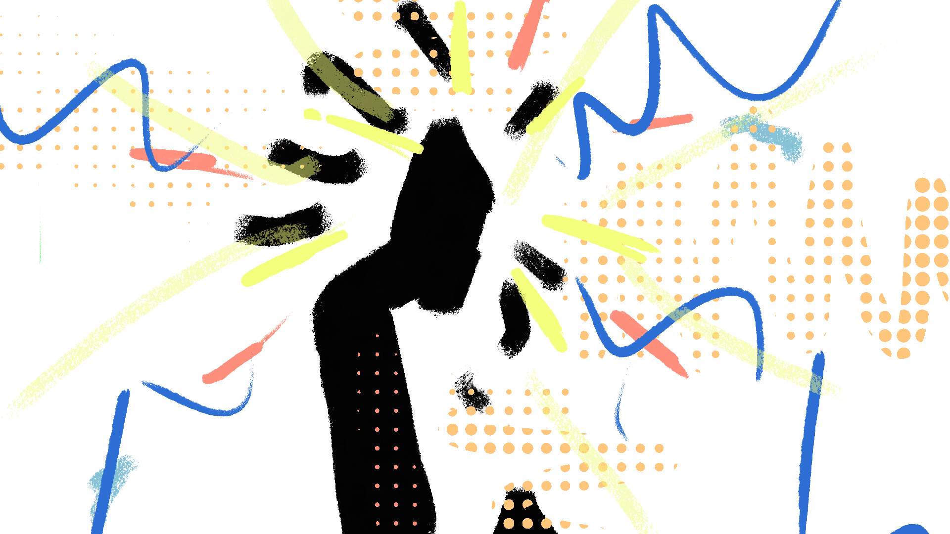
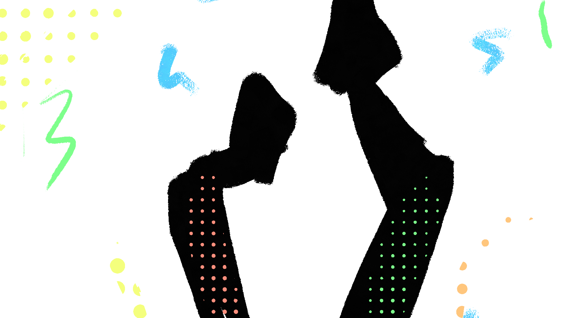
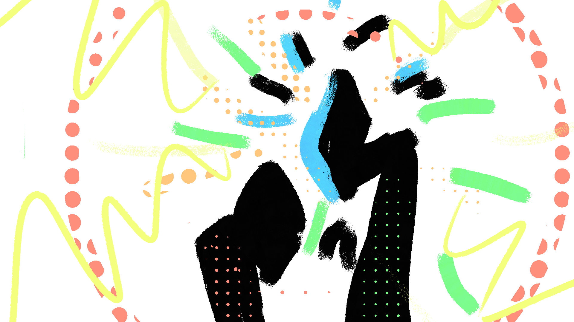
Animated Logo Concepting
The animated logo became the ultimate test of sound-visual harmony. I explored different movements like pulses, flashes, and transitions, each paired with distinct sound cues. The goal was to make the logo not just recognizable but memorable in motion and sound. Each concept pushed the boundaries of timing, rhythm, and scale, proving that when visuals and audio are aligned, a logo transforms into an unforgettable signature


Sound Mixing
The final stage was mixing audio to amplify the visuals. I went for a blend of natural rhythms, like flowing water and wind textures, layered with industrial and urban noises, from train clatters to subtle city hums. This created a tension where industry meets nature, echoing Chicago’s identity as both a city of steel and a city of lakefront energy. The mix emphasized percussive beats for transitions, with melodies woven in to carry the brand narrative. The goal wasn’t just to add sound, but to create an audio identity that elevated the visuals and left a strong sensory impression.
Animated Promo MP3 - Created in Adobe Audition
Animated Logo MP3 - Created in Adobe Audition
Conclusion
The One Chicago Festival project proved that when sound and visuals are designed to support one another, a brand transforms into an experience. From the style guide to the logo animation and final mix, each decision was made to create high-impact resonance—something you don’t just recognize, but remember. By blending bold visuals with soundscapes that capture the spirit of a city, the assignment shows how design can connect on a deeper level, moving from what you see to what you feel.